


 인쇄
인쇄


Question
The charts show the main reasons for study among students of different age groups and the amount of support they received from employers.Summarize the information by selecting and reporting the main features, and make comparisons where relevant.
Possible Answer
|
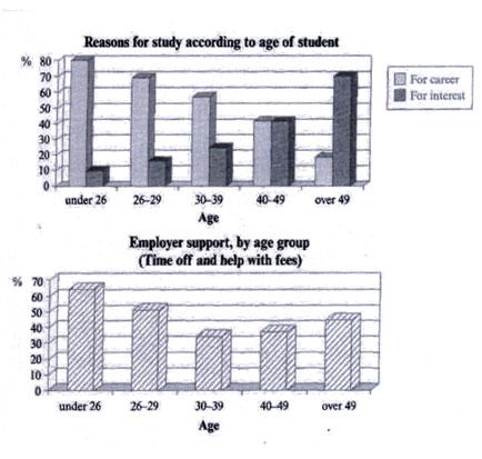
The two charts respectively indicate why students of different age groups decide to study and how much support they have received from their employers.
The first chart reflects that with the increase in age, the percentages of people who study for career prospects decline whhile those who study out of pure interest prevail. The second chart reveals that the younger or older people are, the more amount of support they get from their employers.
Firstly, we see that from age 26 to 39, people who study for career considerations reach a percentage as high as 80% and a lower one is also as high as 50%. When they step into their 40s, people's self-motication to study for career decline,s, but the percentage of those who study out of interest rises. And in this period, we see that the percentages for both motivations draw even at 40%. Starting from 49 years olf, people who study for career fall dramatically to less than 20% while people who study for interest rise sharply to 70 %.
Secondly, in terms of the support obtained from employers, we see that the period of 30-39 age division is a clear-cut dividing line. Before reaching this age division, the time off and help with fees offered by employers account for as high as 60%. However, after this dividing line, this kind of sponsoring drops to 30% and then, with the increase in age, this percentage begins to climb again, rising to 40% with the olderst age group as is shown in the chart.
Thus, through a comparison of the figures exhibited in the two charts, we have learned about the reasons why people study at different ages and the help that employers would like to offer.
|

 댓글 6개
댓글 6개


 불편사항 신고