


 인쇄
인쇄


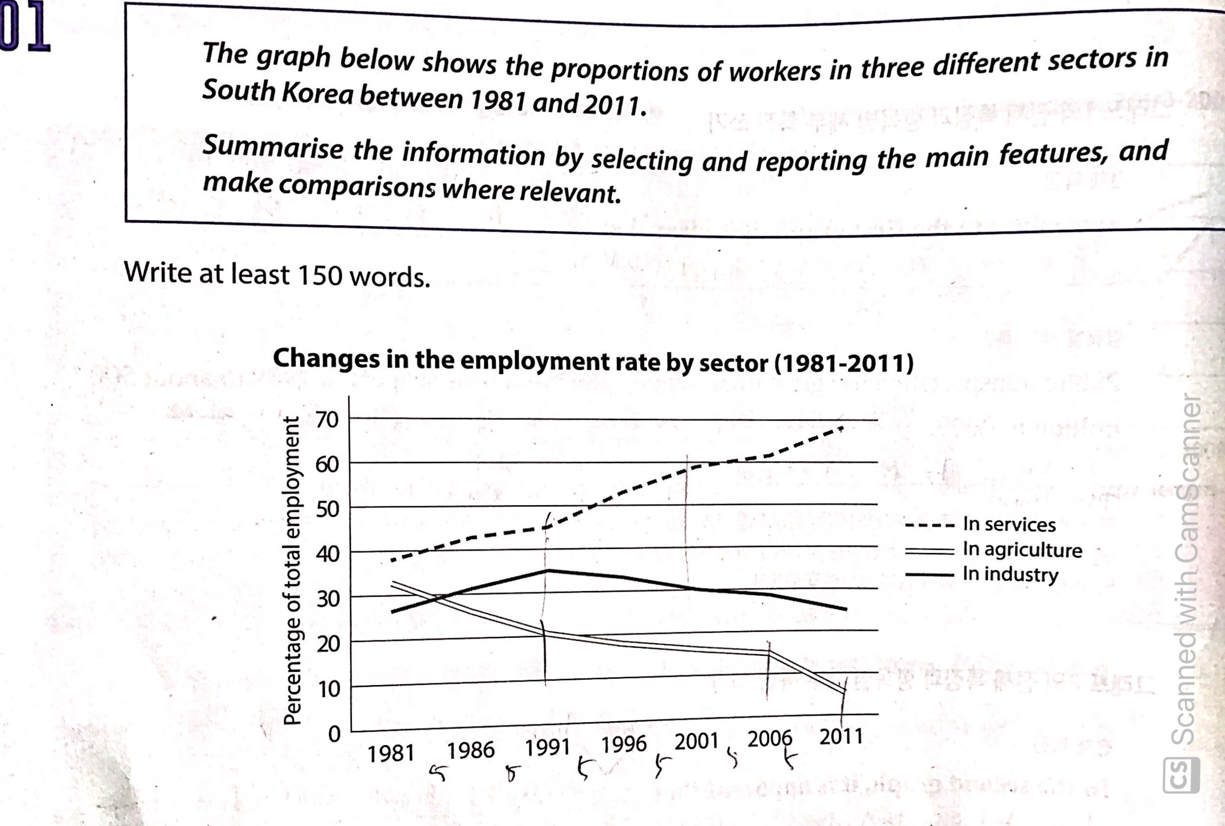
The line figure shows the rates of employment about services, agriculture and industry over a 30-years period from 1981 to 2011 in South Korea.
According to data, there were significant change in service and agriculture workers. By the last year, the gap widened between services and agriculture compared to than in 1981. However, the rate of industry workers fluctuated over the whole period and there were few change between 1981 and 2011 (앞과 같은 의미입니다.).
Looking at the graph more closely, one can see that the percentage of services surged from 1991 to 2001 over the 10-years period even though that increased steadily. Finally, it peaked at around 70% in 2011, which was more twice compared to the sum of that of the other two industries than combined others. In contrast, agriculture fell continueous continuously (문법도 오류가 있었지만, 철자 역시 틀렸습니다.) and hit a low of under 10% in 2001. Industry went up and down in its rate, which they rose bewteen 1981 and 991 but there were was a downward trend following 1991. By 2011, compared to 1981, there was were nealy no change.
총평: (6/6/6/6) 6.0
분석과 관련해서, 각 항목이 어떻게 변했는지를 적는 것 외에도 수치 간 역전을 다뤄주는 것 역시 중요합니다. 예를 들면 지금 표에서는 83~4년 가량에 농/산업 간 수치의 역전이 있으므로 이를 중요한 포인트로 잡고 서술하는 것이 좋죠.
수고하셨습니다 :)

 비밀번호 확인
 댓글 0개
댓글 0개


 불편사항 신고