


 인쇄
인쇄


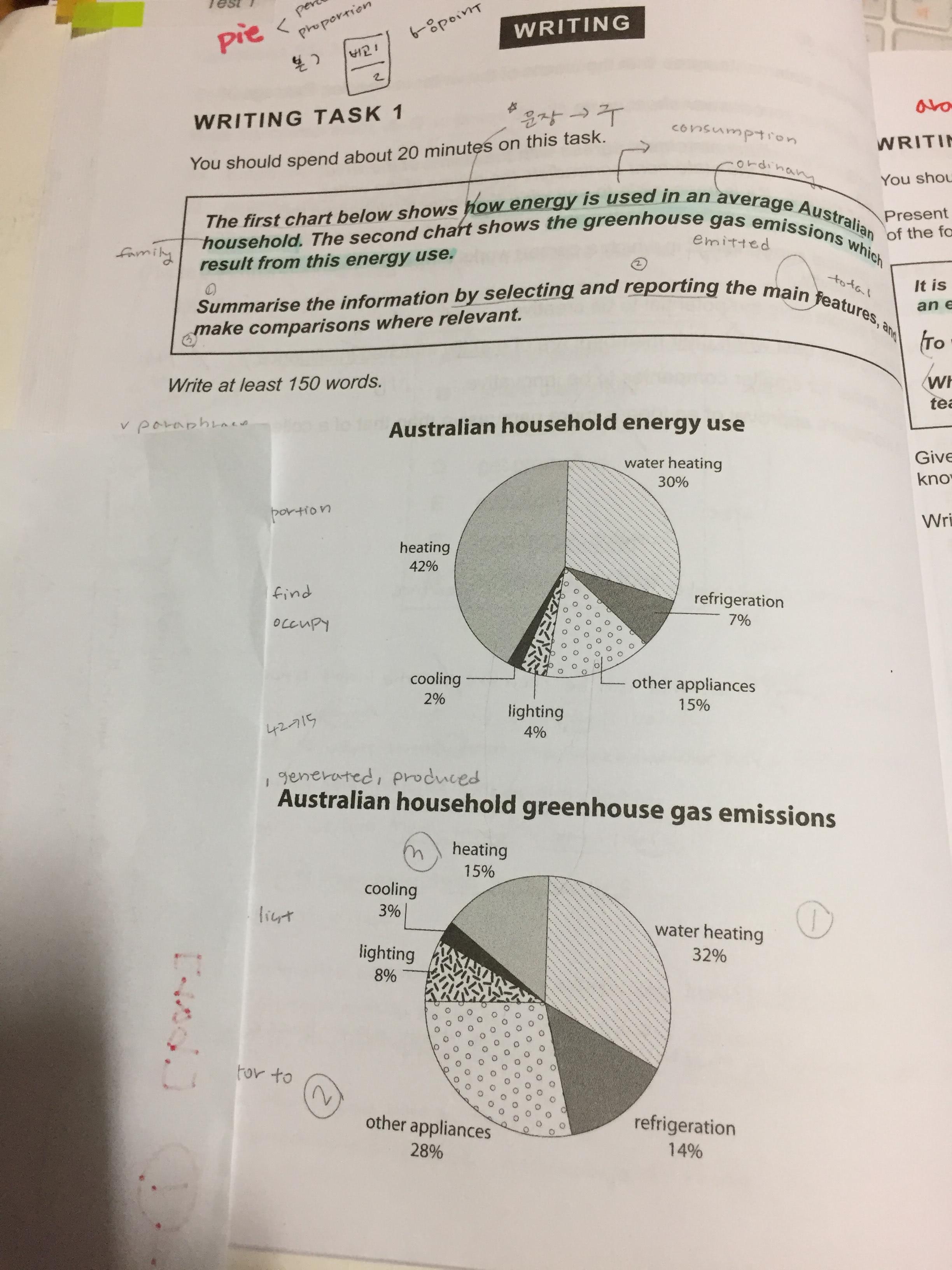
The pie charts depict the information about the percentage of energy consumption and the greenhouse gas emissions in an average Australian household. The percentage of heating energy consumption is the highest and the energy emits greenhouse gas of a half of the level in the list. (여기는 댓글 주세요!)
Turning to the details, heating and water heating occupy the majority of energy consumption occupy heating and water heating. The heating energy dominates (가장 높은 것과, dominate 는 전혀 다른 차원입니다. 후자의 경우 아무리 못해도 75% 정도는 되어야 쓰일 수 있어요.), accounting for 42% and this followed by water heating which represents about 30% percentage. The percentage of other appliances accounts for 15% and refrigeration constitute 7%. The percentage of lighting and cooling represent 4% and 2% respectively. (절대로 나열하지 마세요!)
In regarding of greenhouse gas emissions, the water heating take up the largest percentage, constituting 32%. The other appliances produce 28% of the greenhouse gas. The heating create 15% of the gas which is less than the energy use, 42%. The percentage of heating, lighting and cooling account for 14%, 8% and 3% respectively. (여기도 마찬가지입니다.)
총평: (5/6/7/6) 6.0
이 표에서의 핵심은 초록 부분과 같은 분석이 됩니다. 사용 대비 배출을 비교하는 것이 분석의 포인트가 되므로, 그쪽에 조금 더 포커스를 맞춰주시고, 절대로 절대로 파란 부분과 같이 기계적으로 수치를 나열하지 않도록 주의해주세요~수고하셨습니다 :)

 비밀번호 확인
 댓글 1개
댓글 1개


 불편사항 신고