


 인쇄
인쇄


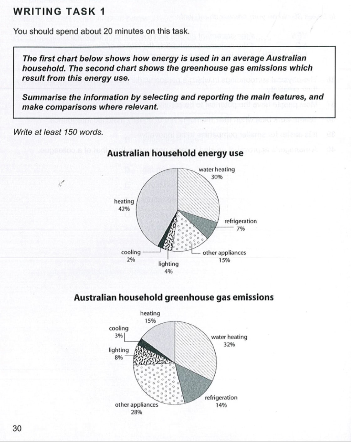
The first pie chart illustrates how energy is used in an average Australian household. In addition, the second pie chart represents the greenhouse gas emissions which result from this energy use. These two pie charts show different patterns slightly. (바로 전 task 1에서 말씀드린 것과 같은 논지로 갑니다. 단순히 다르다라고만 적어서 해결되는 게 아니므로, '어떻게' 다른지를 작성할 수 있어야해요.)
To begin with, in the case of the first pie chart, heating occupies the biggest part in Australian household energy consumption. This figure is 42%. However, this feature is reduced almost half in terms of Australian household greenhouse gas emissions. This figure is only 15% in the second pie chart.
Interestingly, two features such as (여기도 마찬가지로 갑니다. such as 는 전체 중 전체를 나열할 때, 즉 여기처럼 2개 중 2개를 나열할 때에는 사용 불가능합니다.) refrigeration and other appliances increased almost 2-fold in Australian household greenhouse gas emissions compare to energy consumption. In the case of refrigeration, this figure is only 7% in energy consumption, but 14% in greenhouse gas emissions. When it comes to other appliances, this figure is 15% in the first pie chart, but 28% in the second pie chart.
총평: (5/6/5/6) 5.5
정확히 몇 점 목표로하시는지는 모르겠지만, 만약에 6점 이상 필요하시면 overview 는 반드시 현 상태에서 개선이 필요합니다. 이전에 첨부해드린 링크에 적혀있듯이, 애초에 다르기 때문에 두 개나 주어진 거고, 그 다름의 양상을 overview 에서부터 밝혀내는 것이 목표니까 절대로 '다르다' 라고만 적고 넘기지 말아주세요~그렇지 않을 경우 문법/어휘에서 엄청나게 점수를 벌어가지 않는 한 5점대를 벗어나기 어렵습니다.
또한 문법 어휘도 대체로 단조로운 편입니다. such as 의 잘못된 사용도 있고, this figure is, in the case of, 등이 계속해서 쓰이고 있으니까, 마찬가지로 6점 이상 필요하시면 꼭 패러프레이징에도 신경써주세요. 수고하셨습니다 :)

 비밀번호 확인
 댓글 0개
댓글 0개


 불편사항 신고