


 인쇄
인쇄


안녕하세요! 항상 첨삭해주셔서 감사합니다. 목표 점수는 6.0이구 시험은 이번주 토요일입니다!
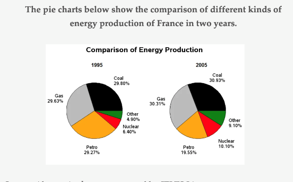
Overall, it is clear that the proportions of coal and gas accounted for over the half of entire graph in both years. Moreover, two figures increased slightly about 1 per cent during the period from 1995 to 2005. By far the greatest increase happened in other from 4.9 per cent to 9.10 per cent. Also, there was a rise in nuclear which is the second highest growth as about 3.70 per cent.
In terms of petro, in 1995, it allocated over a quarter of the whole pie chart. However, it became the only section that showed a downward trend while the percentage of others inclined over the entire research period. In addition, petro displayed the biggest change (about 10 per cent) in the proportions between 1995 and 2005 even though it was a decline.

 댓글 0개
댓글 0개


 불편사항 신고