


 인쇄
인쇄


안녕하세요! 항상 첨삭해주셔서 감사합니다. 목표 점수는 6.0이구 시험은 이번주 토요일입니다!
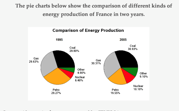
Overall, it is clear that the proportions of coal and gas accounted for over the half of entire graph in both years. (정확히 따지자면, 이 표에서의 overview 는 '항목 간 편중이 2005년에 상대적으로 완화되었다~' 가 됩니다. 6.0 정도에서는 사실 크게 중요한 사항은 아니지만요!)
(구분해주셔야 합니다.)
Moreover, two figures increased slightly about 1 per cent (여기 포함해서 뺄셈을 한 경우는 다 퍼센트포인트를 넣어주세요~) during the period from 1995 to 2005. By far the greatest increase happened in other from 4.9 per cent to 9.10 per cent. Also, there was a rise in the rate of nuclear which is the second highest growth as about 3.70 per cent.
In terms of petro, in 1995, it allocated over a quarter of the whole pie chart. (연도 표현을 해주셔야 합니다.) However, it became the only section that showed a downward trend while the percentage of others inclined over the entire research period. In addition, petro displayed the biggest change (about 10 per cent) in the proportions between 1995 and 2005 even though it was a decline.
총평: (6/6/7/6) 6.5
마찬가지로 퍼센트포인트에 있어 주의해주시고, 실전에서도 이렇게만 쓰실 수 있으면 6.0은 무조건 받으실 거고 6.5도 노려볼법 하니까 너무 걱정하실 필요는 없을 겁니다. 수고하셨습니다 :)

 비밀번호 확인
 댓글 0개
댓글 0개


 불편사항 신고