


 인쇄
인쇄


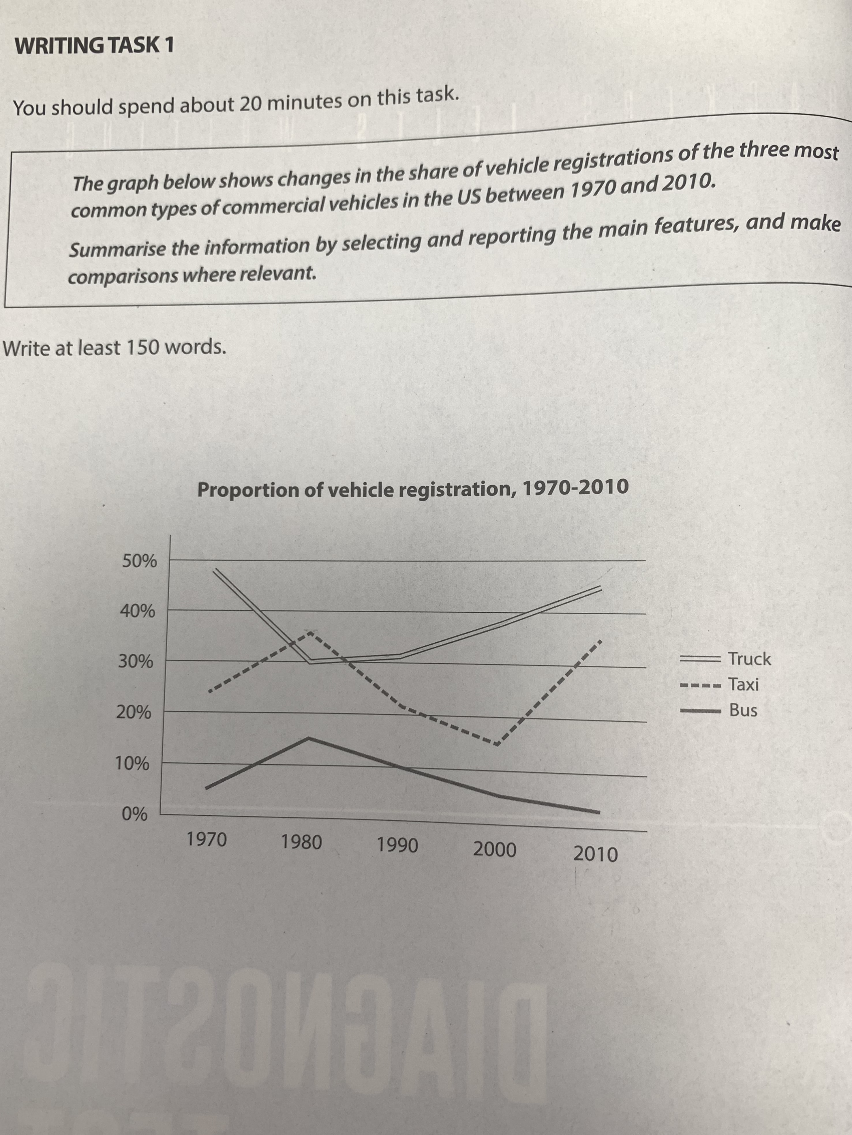
This line graph illustrates changes in the proportion of three types of vehicle registrations in the US between 1970 and 2010. Overall, truck was generally the most popular (여기의 경우 많은 수험생들이 틀리는 사항이므로 주의해주셔야 합니다. 표 문제에서 어떠한 수치가 가장 높다고 해서, 그걸 무조건 인기가 많다고 해석해서는 안 돼요. 실제로 이 표의 경우도 인기도와는 아무런 관련이 없고, 그저 가장 많이 등록된 차량에 대한 정보만 주고 있을 뿐입니다. 고로 여기도 그냥 트럭의 등록률이 가장 높았다~라고 적는 게 맞습니다.) vehicle over 40 years followed by taxi and bus.
To be specific, the number of taxi and bus registration reached the peak in 1980 as of 35% and 15% for each, while the corresponding figure of truck hit the lowest in 1980 with 30%. Moreover, the truck registration had increased steadily from 30% to 45%, but bus registration had decreased gradually from 15% to 3% after 1980. On the other hand, there was a fluctuation for the taxi registration. It dropped rapidly between 1980 and 1990, and slowed down in 2000. After that, it increased significantly in 2010, reaching about 35%. In comparison between 1970 and 2010, the rank of popularity of these three vehicles is same in the order of truck, taxi and bus. (1. 여기의 경우도 인기도와는 아무런 관련이 없습니다. 2. 1980년의 경우 예외가 되므로 지금과 같이 전 기간에 걸쳐서 같다고 할 수는 없습니다.)
총평: (6/6/6/6) 6.0
popular의 경우 써도 되는 표가 있고 그렇지 않은 표가 있는데, 후자가 훨씬 많기 때문에 헷갈리면 그냥 안 쓴다고 생각하셔도 좋습니다.
또한 꺾은선 그래프에서는 수치 간 역전을 다루는 게 중요합니다. 이 표의 경우 80년대에 트럭과 택시 수치 간 역전이 이루어지므로, 그 시점을 중요 포인트로 잡야주시면 됩니다.
수고하셨습니다 :)

 비밀번호 확인
 댓글 0개
댓글 0개


 불편사항 신고