


 인쇄
인쇄


The chart below shows the percentage of
total US population aged 65 and over between 1900 and 2000.
Summarise the information by selecting
and reporting the main features, and make comparisons where relevant.
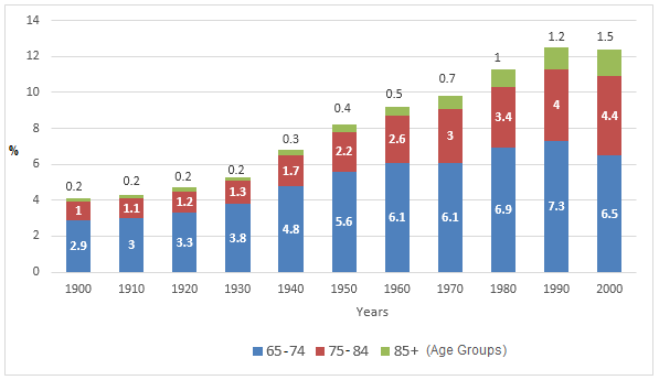
The illustration shows that the ratio of
the elderly over 65 year-old categorizing three groups in American population ranging
from 1900 to 2000.
It is clear that the occupation of the
aged rose during the period shown in the graph. Until 1930, the growth remained
stable. On the other hand, after 1940, the aged people compared to the total
population gradually increased up to over 12%.
To be more specific, the majority of
percentages in the aged groups is the first group, which includes people aged
between 65 and 74. In 1990, the percentages of first group were nine times
higher than those of the last group that over 85 year-old seniors were included.
However, due to the changes, those of first group were just five times higher
than those of the last group.
One of the most interesting features in
the graph is that the changes in the first group All three groups have an
upward tendency during that period, however, the first group between 1990 and
2000 had diminish from 7.3% to 6.5% unlike last almost one hundred years.
21분/ 181자

 댓글 0개
댓글 0개


 불편사항 신고