


 인쇄
인쇄


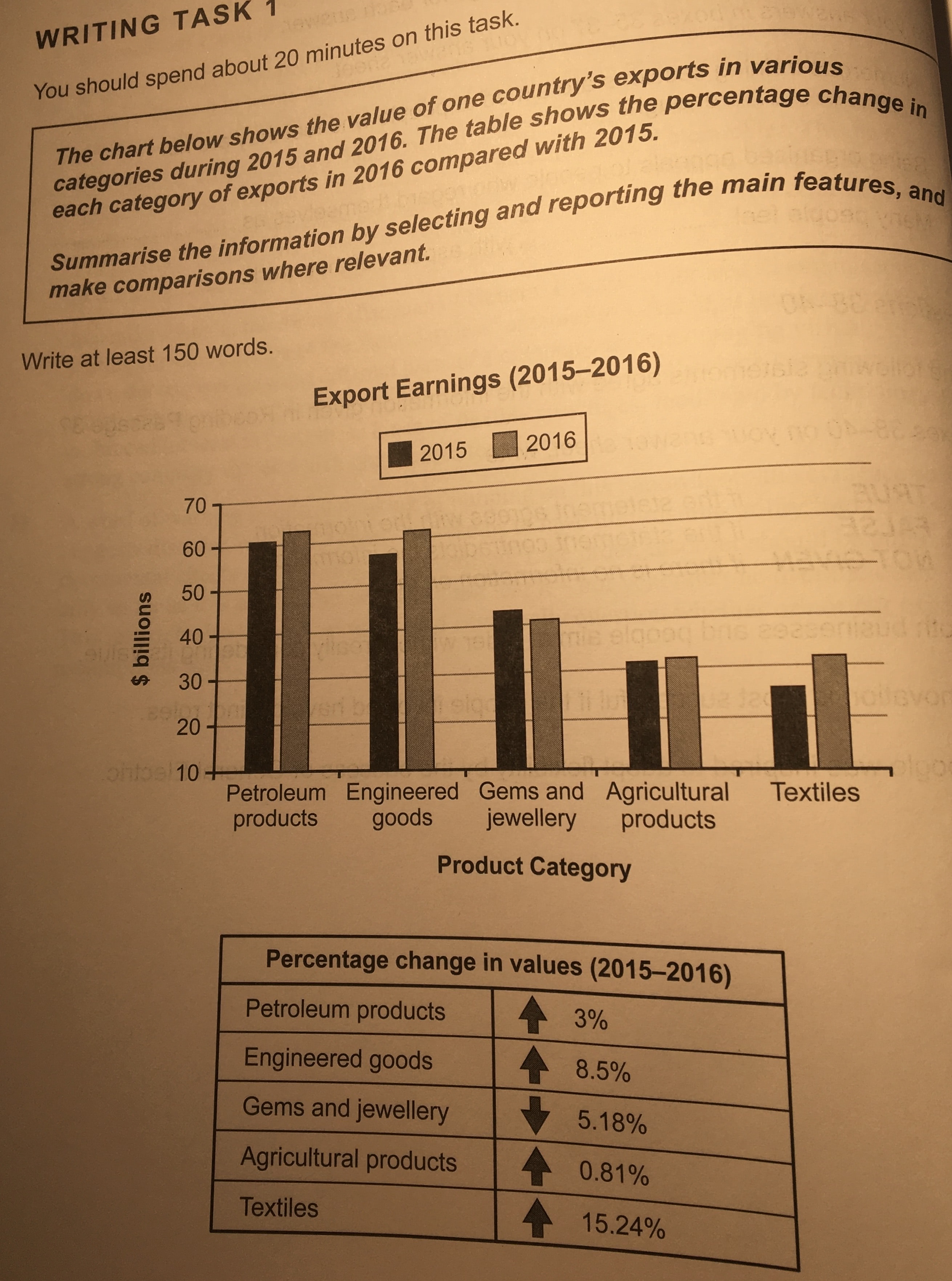
The bar graph indicates the value of one
country’s export in variety of categories from 2015 to 2016, and the table
shows the proportion changes in five categories of exports between 2015 to
2016.
According to the first graph, it is clear that amount of export earnings of all of the categories except for gems and jewellery, which is increased in between 2015 and 2016. In 2015, one country exported petroleum products the most. However, it earned the lowest amount of money by selling of textiles. In 2016, the same country also made the most money with the petroleum products. In addition, the figure of the agricultural products and textiles were once again the biggest, among the given categories.
In the second graph, it is apparent that the value of the each category increased except for the worth of gems and jewellery. The proportion of values of textiles was changed the most between 2015 and 2016, by 15.24 percent. In contrast, the worth of agricultural products increased only 0.81 percent over this period.

 댓글 0개
댓글 0개


 불편사항 신고