


 인쇄
인쇄


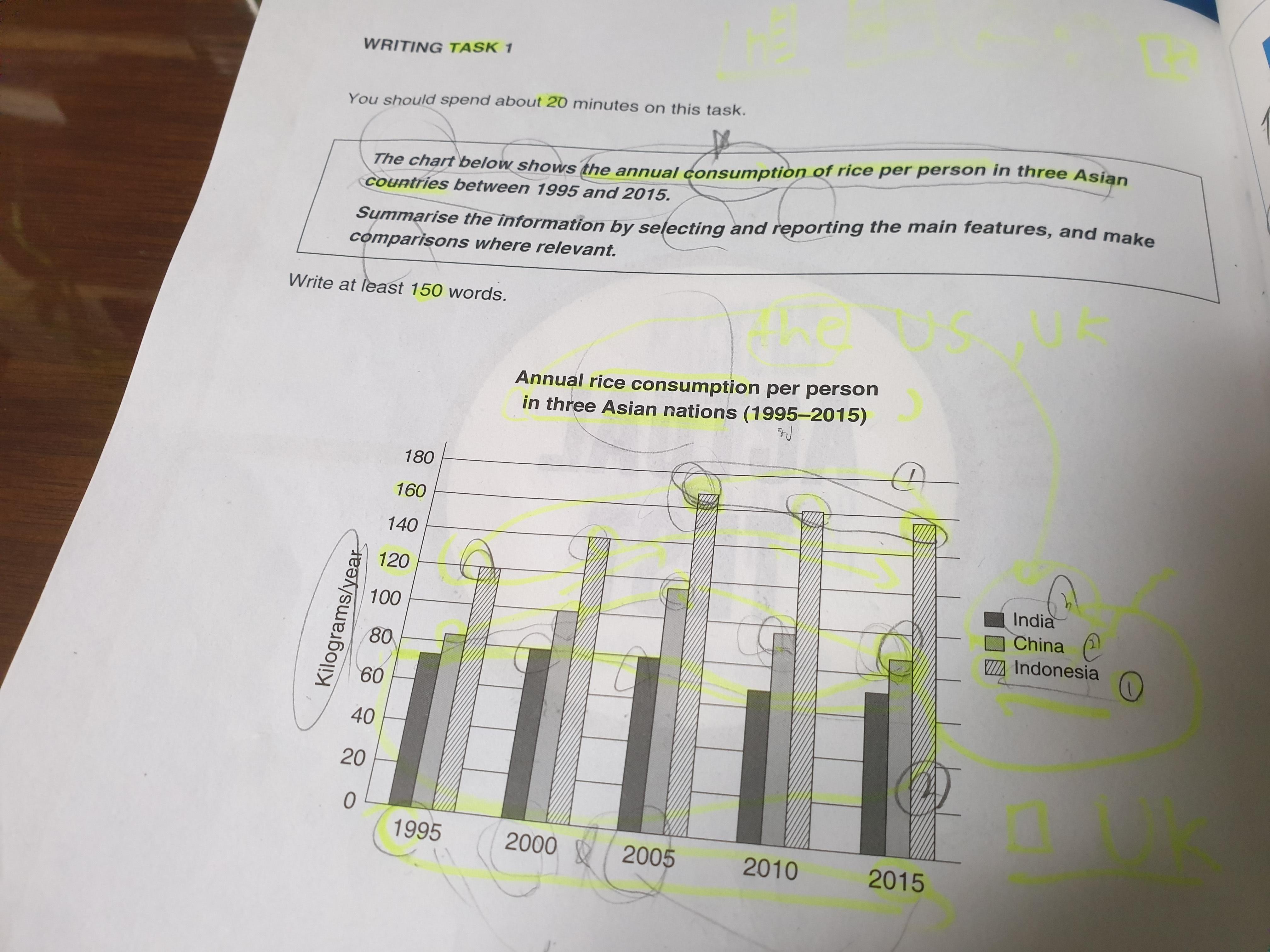
The chart shows that annual rice consumption per person in three Asian nations over 20 years.
Overall, It it is evident that the figures of three nations look very similar. In 2005 the annual Annual rice consumption per person is the highest. (단순 '비슷해보인다' 로는 표를 포괄적으로 요약할 수 없습니다. '기간 내내 인도네시아의 수치가 가장 높았고, 인도의 수치가 가장 낮았지만, 20년이 지나면서 그 격차는 더욱 커졌다~' 라고 작성해주셔야 해요.)
Relatively, there is a very slight chage change in the figures of India compared to that of the other two nations. (변화한 것은 인도 자체가 아니라 인도의 수치입니다. task 1에서는 항상 주어를 정확하게 갖춰주세요!)
Looking at the chart more closely one can see that Indonesia's figure is from 120 kilograms (띄어야 하고, 1키로가 아닌 이상 s는 무조건 붙습니다. 다른데에도 다 수정해주세요! in 1995 to 161 kilogram in2005.
On the other hand, the figure declines slightly between 2005 and 2015.
Similarily, china's China's figure has a very similar trend compared to Indonesia's.
This figure is also highest at 119 in 2005, then it decreased gradually.
Finally, India's figure is totally different from China and Indonesia. There is a flat trend.
Between 2000 and 2005, these figures are the same at 80 kilogram and In 2010, this figure declined to at 65 kilogram then
it increased to at 68 kilogram.
총평: (5/5/5/5) 5.0
이전 글과 마찬가지로 엔터키 사용에 있어 주의해주시면 되겠습니다. (엔터를 한 번만 치는 경우는 이유불문 없습니다.)
내용상 보완점의 경우, 현재 글은 동일 국가 내 연도 간 수치 비교만 되어있는 상태입니다. 반면에 동일 연도 내 국가 수치 간 비교는 전혀 없고요. 따라서 현재 분석 중 일부를 줄이되, 제가 말씀드린 사항을 넣어서 다방면의 비교/분석이 될 수 있도록 해주세요! 수고하셨습니다 :)

 비밀번호 확인
 댓글 0개
댓글 0개


 불편사항 신고