


 인쇄
인쇄


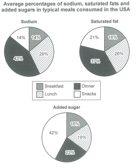
The 3 pie charts show the average percentages of sodium, saturated fats, and added sugers in typical meals of the USA. Overall, dinner had the largest amount of percentage at the graph of both sodium and saturated fat. In case of graph of added sugers, snacks took the largest percentage, showing higher than all other meals.
To look at the graph more closely, largest percentage of sodium that was put inside the meal was dinner, and lunch came after. Breakfast and snacks had the same percentage, both lingering at 14%. In case of saturated fat, just like the dinner in graph of sodium took the highest percentage, dinner was also rated most high. Next, the rankings were followed by lunch, snacks and breakfast. Meanwhile, snacks had the largest percentage of added sugers graph with 42%, and dinner was second highest of all, rating 23%. While lunch and breakfast had percentage lower than 20%.
2.14에 시험 신청했습니다!
그때까지 꾸준히 열심히 하겠습니다! 감사합니다 선생님!!
첨삭과 grading 부탁드리겠습니다!ㅠㅠ

 댓글 0개
댓글 0개


 불편사항 신고