


 인쇄
인쇄


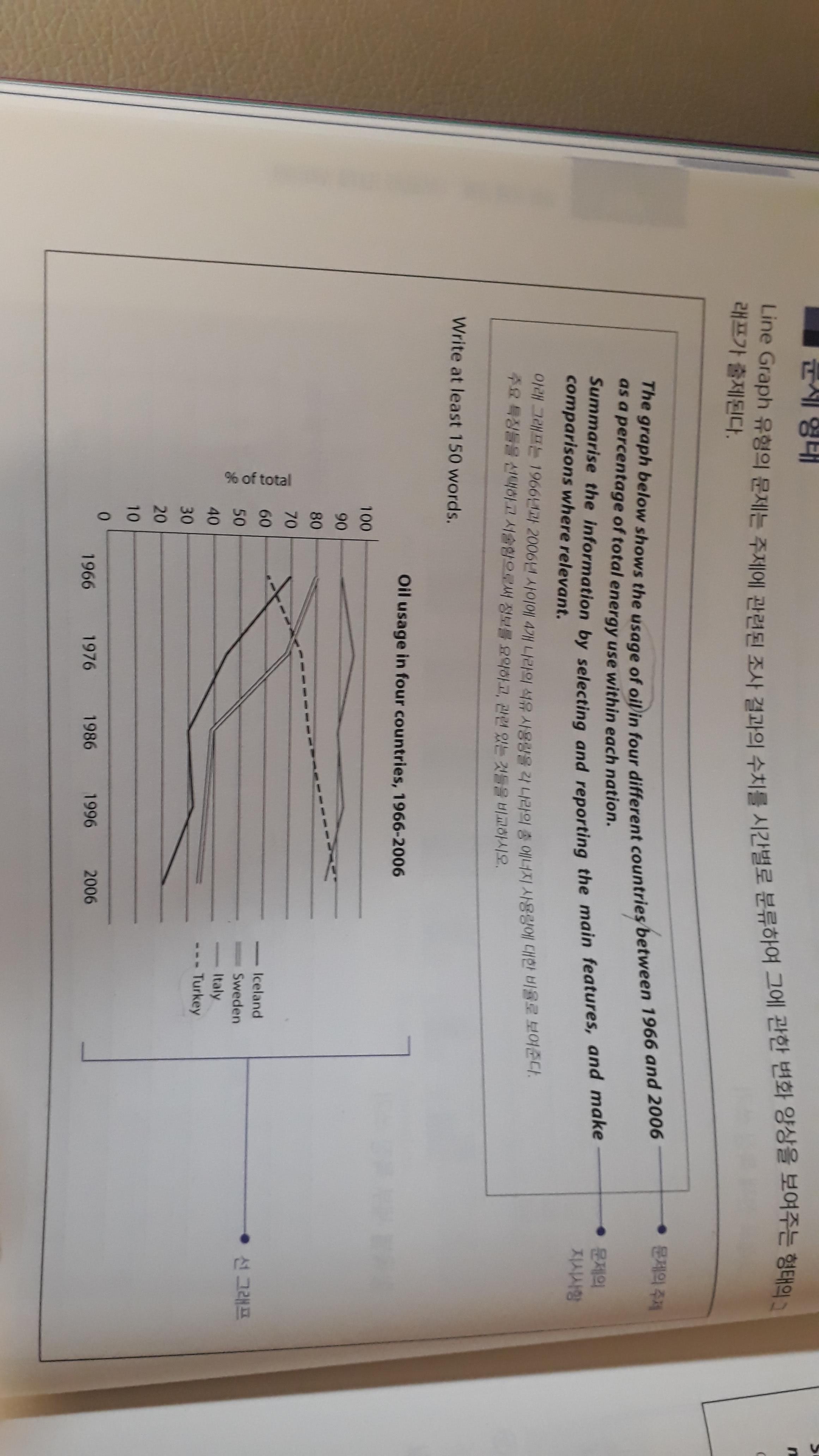
The chart illustrates the percentage of the oil consumption in four different countries over the period from 1966 to 2006.
As clearly seen from the chart, consumption in Italy was by far the greatest at the beginning of the period, remaining stable at about 90% throughout 50 years. Looking at Sweden and Iceland, their figures showed a similar change during entire period, being decreased by more than half to 35%~~ more than halving at 35% and 20% respectively.
In contrast, figure for Turkey rose significantly from 60% to 90% by the end of the period, overtaking that for Italy in around 2000.
According to the figure provided, the amount of oil consumed in Iceland, Italy, Sweden showed a downward trend, while usage of that in Turkey continued to increase. (지금 적어주신 내용이 overview 라고 보시며 되는데, 이때 task 1의 overview 는 서론 밑으로 넣어주셔야합니다.)
총평: (5/6/6/6) 6.0
사실 글자수 감점은 감안하더라도 실전에서 이정도만 쓰실 수 있다면 5.5는 무조건 받으실 겁니다. 6.0도 어찌저찌 가능해보이고요. (문법/어휘가 정말 절망적인 상황이 아닌 이상, 5.5/6.0은 그 어떤 수험생이나 다 받을 수 있습니다. 지금 문법/어휘는 절망과는 거리가 멀고요!)
그래도 어쨌든 여기서 더 안전한 점수를 만들어야하니까 말씀드리자면, 세 번째 문단을 보충하고자 하면, 이탈리아의 수치를 역전하는 것 외에 스웨덴과 아이슬랜드의 수치 역시 따라잡히니까 이걸 넣는 것도 좋습니다. 바로 얼마 전에 동일 표에 대해 작성해주신 수험생의 글이 있는데, 그 글도 완벽하지는 않으나 그래도 내용은 충실하게 채워졌으므로 한번 참고해보세요! 수고하셨습니다 :)
https://www.gohackers.com/?c=ielts/ielts_info2/ielts_writing&p=4&type=url&uid=475236undefined

 비밀번호 확인
 댓글 0개
댓글 0개


 불편사항 신고