


 인쇄
인쇄


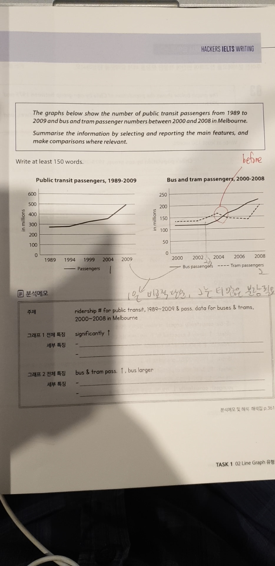
The graphs illustrate the number of public transit passengers from 1989 to 2009 and bus and tram passenger numbers between 2000 and 2008 in Melbourne.
According to the first graph, the number of passengers using public transportations shows an upward trend throughout the period in question. During the first 5 years from 1989, the number of passengers remained almost constant. However, public transportation users grew significantly from around 250 million in 1994 to 360 million in 2004. In the last 0five years, the passengers soared sharply, reaching nearly 500 million.
In the second graph, both bus and tram passengers grew but it is apparent that bus users soared remarkably. The number of bus users stayed at around 120 million for the first three years, before it shot up in 2003. The number of bus passengers had approximately doubled from 120 million in 2003 to 230 million in 2008. The usage for tram was flat until 2002, at which point it increased for two years before it dipped slightly. Then from 2007 to 2008, it soared sharply by over 50 million just in one year.
Comparing these two graphs, one can identify that the number of public transportation users in Melbourne had been concentrated on buses and trams, as they account for almost 85 percent of total users.
많이 감사드립니다.

 댓글 0개
댓글 0개


 불편사항 신고