


 인쇄
인쇄


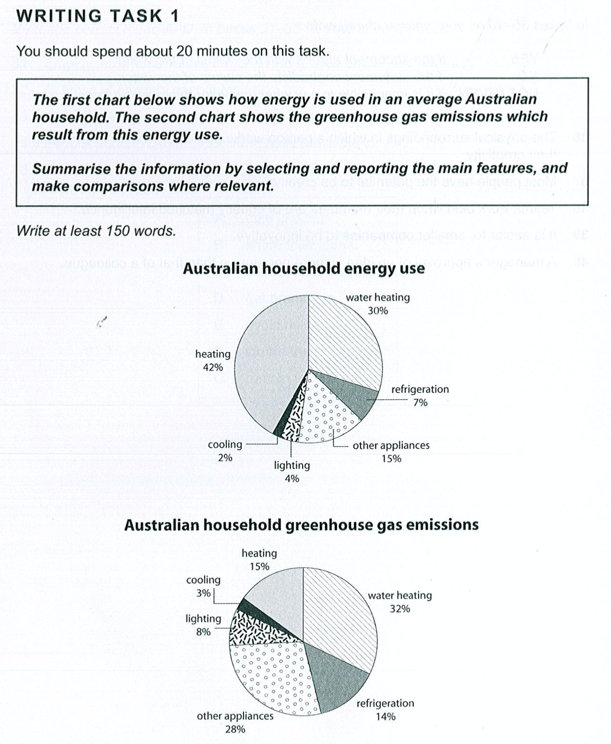
The first given pie chart demonstrates the energy usage of a common Australian for various purposes. The second pie chart demonstrates the emitted greenhouse gas from the former chart which is energy that Australian used. In overall, the proportion of energy usage is relatively tend to biased while the greenhouse gas chart does is not.
Speaking of the first pie chart, Australian used roughly 3 three quarters of energy to heat, and energy used for other machines were 15%. A refrigerator Refrigerator used 7% of total energy, and following this, ratio for lighting was 4 (단위는 타협 불가입니다!), and at last, 2% was for cooling.
Moving to the next pie chart, the highest emission of given units was water heating, at 32%. 28% of greenhouse gas was exhausted from other appliances, and refrigerator emitted 14% of total greenhouse recording. The most use (뭐에서 most use 인지를 언급해주셔야겠죠. 이 경우 에너지 사용이 되겠고요.), heating showed only 15% emission from total, was 4th highest unit in the chart. Lighting and cooling were followed, its ratio were 8 and 3 (여기도 마찬가지입니다.), respectively.
159자, 25분
작성한지 몇 일이 지나 정확히 기억은 아닙니다만 작성 시 그림 비교가 이상한 것 같았고 이로인해 시간이 좀 더 걸린 것 같습니다
잘 부탁드립니다
총평: (5/7/7/6) 6.5
참고로 시간 때문에 실전에서는 6.5가 아닐 가능성이 매우 높습니다. 따라서 시간 조절에도 슬슬 신경써주세요~
이 표의 경우 핵심은 두 표 간의 비교가 됩니다. 즉 단순히 각 수치가 어땠는지 나열만 하는 게 아니라, 저 위의 파란색 표현들과 같은 부분들이 조금 더 있어야 하는 것이죠. 이에 맞춰서 글을 수정해주시면 되겠습니다. 수고하셨습니다 :)
+문법 공부는 따로 말씀 안 드려도 매일매일 하고 계시리라 믿겠습니다!

 비밀번호 확인
 댓글 1개
댓글 1개


 불편사항 신고