


 인쇄
인쇄


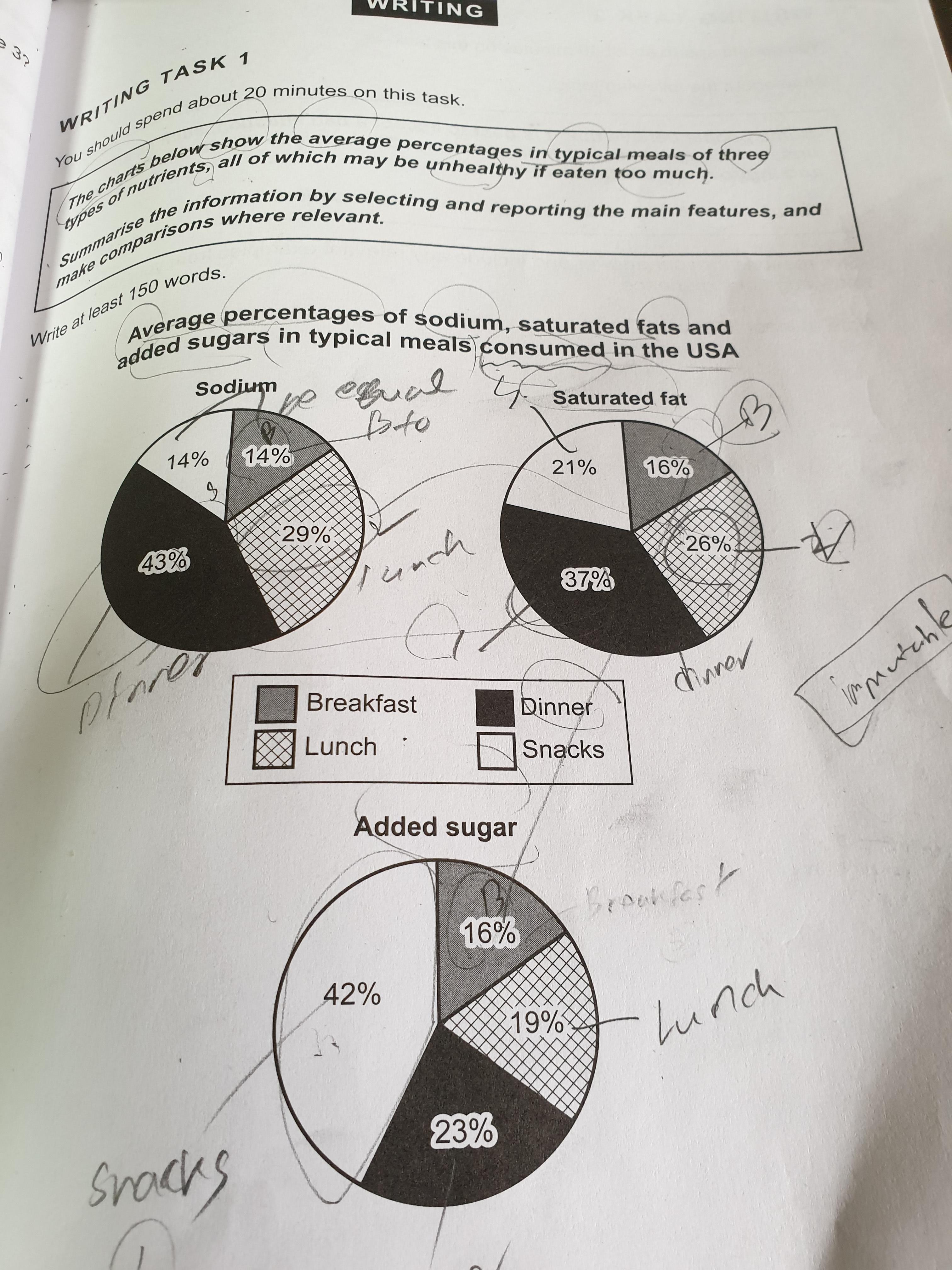
The pie charts indicates that average rates in ordinary meals of three sorts of nutrients, all of which if intaken too mch all nutrients may have a negative impact on people's health. I will outline three pie chart below.
Overall, the charts of sodium and saturated fat show that these nutrients are taken the most during dinner, while in the case of added sugar, it is during snacks when they are consumed the most every piechart showed that percentages of most nutrients focus on dinner with the exception of added sugar. (고작 두 개, 한 개로 every, exception 을 사용할 수 없습니다.)
As it can be clearly seen by all pie charts, both the percentage of sodium and the percentage of saturated fat were consumed at dinner the most. The figure if sodium is 43%, and the figure of saturated fat is 37% respectively. In contrast, the rate of added sugar consumed snacks the most at 42%.
Looking at the pie chart more closely, the rate of sodium consumed during snacks and breakfast are totally the same at 14% each. Not only that, between the rates of saturated fat and added sugar spended consumed in breakfast are the same at 16%. Interestingly, compared to every pie chart, the rate of all nutrients intook intaken in breakfast is the least around 15% each.
총평: (6/6/6/6) 6.0
이 표는 진짜 어려운 편이고, 실전에서도 이렇게 다시 출제되기는 조금 무리가 있기 때문에 위에 수정해드린 사항도 파고들지 마시고 그냥 휙 읽어본 다음에 이 표는 잊으세요! 대신 나름 잘 쓰인 글을 하나 넣어드릴테니 딱 이것까지만 한번 보시면 됩니다.
수고하셨습니다 :)

 비밀번호 확인
 댓글 0개
댓글 0개


 불편사항 신고