


 인쇄
인쇄


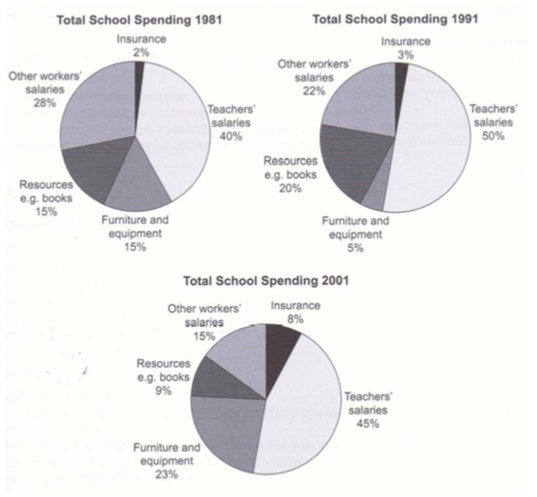
The pie charts indicate the proportion of school expenditure in the UK in 1981, 1991 and 2001.
Overall, it is clear that the portion of teachers’ salaries remained the highest at nearly above 40 percent over the 20-year period.
Looking at the pie charts more closely, one can see that the fraction of other workers’ salaries generally showed a downward trend from 1981 to 2001. (몇%에서 시작했는지, 몇%에서 끝났는지 정도는 언급해주셨는데 좋습니다.) Meanwhile, it is evident that resources and furniture and equipment are fluctuated in rate over the 20 years period, accounting for respectively roughly under 25 percent. It is noticeable that the figure for resources increased steadily during 20 years period, making up almost a quarter in 2001.
As well as, in 2001, the expenditure of the whole sections are comprised approximately similar than other two periods, except for teachers salaries and furniture and equipment. In 2001, the expenditures show a similar trend to the previous two periods, except for~~~ Moreover the greatest rate is shown in teachers salaries, is which had took half of this chart in 1991. Finally, this figure of insurance hitted a low just under 10 per cent in the whole period.
곧 시험이라 발등 떨어져서 처음 올려보네요,, 잘부탁드립니다.
6점 목표로 삼고있어요!
총평: (6/5/6/6) 6.0
6.0은 그렇게 높은 점수가 아니며, 어쨌든 지금 문법+어휘에 크게 문제가 있는 건 아니므로 시험장에서 시간 부족 등의 변수를 빼면 아마 웬만하면 받으실 겁니다.
그러나 지금 내용 배분에 있어서는 전혀 깔끔하지 않기 때문에 만약에 5.5로 내려간다고 하면 이거 때문일 거에요. 기본적으로 문단을 나눌 때에는 명확한 기준이 존재해야합니다. 그러나 현재 마지막 두문단은 어떠한 기준으로 나뉘었는지 전혀 파악이 안 되는 상황이죠. 또한 순서와 관련해서도 마지막 문단에서 2001년에 갔다가 다시 91년으로 돌아오는 등 내용 정돈이 안 되고 있으니, 글 작성 전 꼭 간단한 개요 작성을 통해 뼈대를 확실히 잡아주세요!
수고하셨습니다 :)

 비밀번호 확인
 댓글 0개
댓글 0개


 불편사항 신고