


 인쇄
인쇄


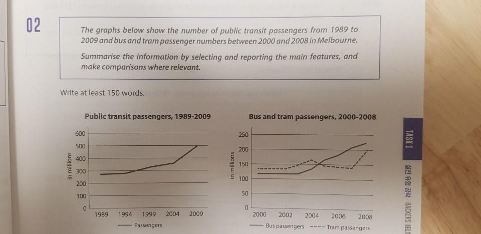
The first line graph shows public transit passenger numbers between 1989 and 2009, and the second line graph shows bus and tram user numbers from 2000 to 2008 in Melbourne.
According to the first graph, it is clear that the number of public transit passengers was relatively consistent between 1989 and 1994 and an upward trend was seen over the 10 years. Afterwards, the figure surged dramatically, reaching the highest point of about 400 million in 2009.
In the second graph, it is apparent that bus passenger numbers increased significantly and became larger than the tram's figure from 2004 to 2008, while there was no change during the first three years. Meanwhile, the number of tram passengers remained almost constant at nearly 150 million, but it went up rapidly from 2007 to 2008.

 댓글 0개
댓글 0개


 불편사항 신고