


 인쇄
인쇄


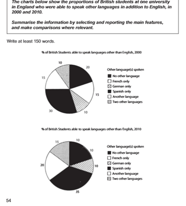
These pie charts illustrate the different percentages of British students that can speak a foreign language in 2000 and 2010. There are six various categories consisted of charts such as ‘two other languages’. ‘another language’, ‘Spanish only’, ‘German only’, ‘French only’, and ‘no other language’. (이런 거 따로 나열하지 않습니다. 그 시간에 세부적인 분석에 집중해주시면 돼요.)
To begin with, the first thing that is clear to see from the above figures is that the most highest proportion of England university students who were able to speak another language was ‘no other language’ in both 2000 and 2010, which was accounted for 30% and 35% each. (스페인어랑 no other language를 착각해서 보신 것 같은데, 이는 표의 색깔만 보면 그럴 수 있기 때문에 일단은 그냥 넘어가겠습니다.) In addition, the proportion of ‘German only’ and two other languages’ recorded the same at ten percent in 2000. Anyone can see that the percentage of ‘Spanish only’, which consisted of twenty percent was two times higher than the percentage of ‘German only’, which explained ten percent in 2000. Incidentally, it is impressive to note that there are three same percentages which were ten percent in three different categories such as ‘no other language’, ‘French only’, and ‘German only’ in the pie chart of 2010.
In conclusion, the most of British student were not able to speak another language except their mother tongue in the year of 2000 and 2010. (이렇게 적으면 대다수의 학생이 모국어 외 다른 외국어를 할 수 없었다~라는 의미가 됩니다. 그러나 표에서 볼 수 있듯이 반대가 되어야하죠. 대부분의 학생들은 최소 한 개 이상의 외국어를 할 수 있으니까요.) The next point was they had a tendency to learn Spanish when they choose the second language. (스페인어의 비율이 가장 높은 건 맞지만, 그렇다고 압도적인 수치를 보이는 것도 아니기 때문에, '경향을 보였다~' 라고 할 수는 없습니다.)
총평: (5/5/6/5) 5.5
task1에서는 결론을 따로 쓰지 않습니다. 대신 Overview 라는 것을 넣어주시면 되는데, 이 Overview는 서론 밑으로 넣어주시면 돼요. 내용의 경우는 지금의 마지막 문단과 비슷하게 표를 전반적으로 포괄할 수 있는 사항으로 채워주시면 됩니다. 예를 들면 여기의 경우 'Overall, 2000년에 비해 2010년에는 최소 한 개 이상의 외국어를 할 수 있는 학생의 비율이 늘어났다~' 라고 작성해주시면 되겠습니다.
수고하셨습니다 :)

 비밀번호 확인
 댓글 0개
댓글 0개


 불편사항 신고