


 인쇄
인쇄


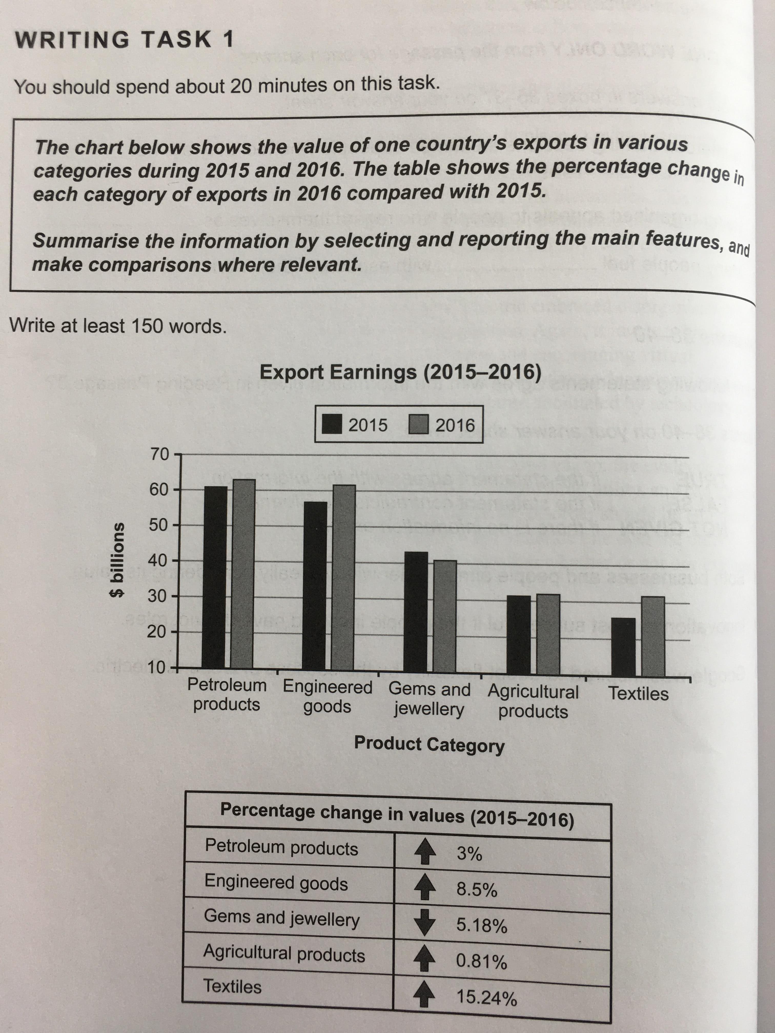
The bar graph illustrates the export incomes in a nation through diverse categories in the year 2015 and 2016 and the table chart indicates the proportion of alteration of income in each category between 2015 and 2016.
All
in all, most products showed the upward trend of the percentage change in
values, whereas only the export of gems and jewellery is demonstrated the downward
trend. Particularly, thee is the highest per cent increase in textiles Textiles.
Looking
at the bar and table more closely, one can see that petroleum products are
logged approximately $60 billion values of export in 2015 and 2016, and there is
3% improvement in income. Meanwhile, agricultural products recorded a slight
increase in percentage as 0.81% to just above $30 billion' income from 2015
to 2016. In contrast, there are two significant rising rises in engineered goods and
textiles, which rose 8.5% and 15.24% by from nearly $55 billion to more than
$60 billion and from around $25 billion to higher than $30 billion
respectively. On the other hand, export earnings of gems and jewellery are
decreased as 5.18%, which noted much more than $40 billion in 2015, while in
2016 its values exported just almost $40 billion.
총평: (6/7/7/6) 6.5
마찬가지로 이정도만 되면 6.5 선에서는 해결이 될 것 같은데 (시험장에서도 시간 내에 이정도 정확성을 유지한다는 가정 하에)
엄밀히 따지면 내용상으로는 약간의 수정이 필요합니다. 지금과 같이 모든 항목을 다 다룰 필요는 없지만, 대신 첫 번째 표 기준으로 가로 방향에서의 비교, 즉 항목들 간 뭐가 가장 높았는지, 낮았는지에 대한 정보도 넣어주셔야해요. 그래야 다방면의 분석이 됩니다. 수고하셨습니다 :)

 비밀번호 확인
 댓글 0개
댓글 0개


 불편사항 신고