


 인쇄
인쇄


Answer:
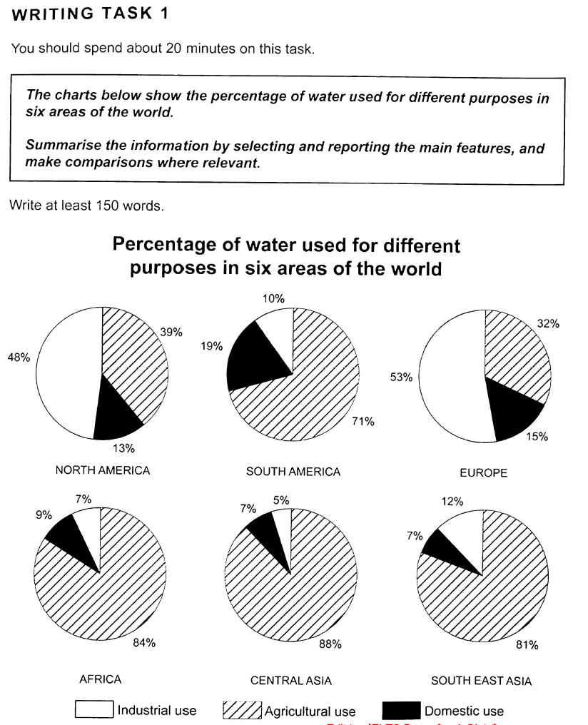
The charts shows the percentage of water
used for different purposes in six areas of the world. The purposes of the
water use are categorised according to three different purposes such as industrial
use, agricultural use, and domestic use. (이런 거 나열할 필요 없습니다.) The water used for agricultural use
accounts for the largest portion in the areas of the world including South
America, Africa, Central Asia, and South East Asia and Africa while the use of water for industry
takes the largest part in North America and Europe. The use of water for
agriculture in North America and Europe is also significant compared to the one
for domestic use. The water used for domestic purpose shows the minimum portion
compared to other purposes except South America. It seems like that the rate of
the water used for different purposes are highly likely to depend on the degree
of industrialisation in each individual area of the world. This is may be the
reason why the water used for industrial use takes up the biggest part in the
areas such as North America and Europe since these areas are relatively
developed compared to other areas in the figure. (이런 식의 자의적인 해석을 하는 게 아니라, 철저히 수치를 바탕으로 드러나는 점에 대해서만 요약과 분석을 해주셔야합니다. 구체적인 수치를 적으면서 작성해주세요!)
총평: (5/5/6/6) 5.5
일단 기본적인 영어 실력이 좋으신 축에 속하기 때문에, 글 작성에 대한 요령만 익혀주시면 6.5 이상까지는 무난하게 받으실 것으로 보입니다.
문단을 먼저 구분해주셔야하는데, 이것 역시 점수에 들어가니까 주의해주세요!
또한 말씀드렸듯이 표에 대한 자의적인 '추론' 이 아니라, 드러난 수치를 가지고 분석을 해주셔야하는데 이와 관련해서는 다른 수험생의 글을 보시면 대략 감이 잡힐 겁니다. 수고하셨습니다 :)

 비밀번호 확인
 댓글 0개
댓글 0개


 불편사항 신고