


 인쇄
인쇄


이게 topic이고 저는 이렇게 적었습니다.
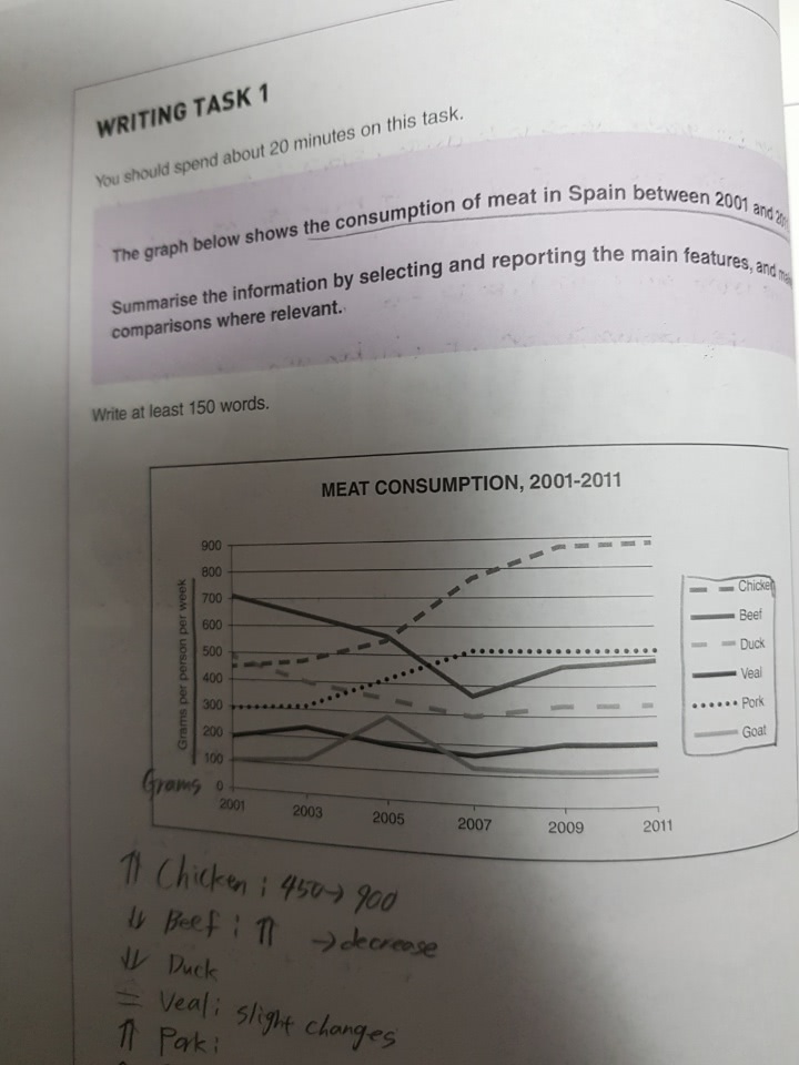
The given line graph describes data regarding how much grams Spanish people ate up six kinds of meat per week from 2001 to 2011.
Looking from an overall perspective, it is obvious that an upward trend was seen in the consumption of Chicken and Pork between 2001 and 2011, while the amount of other types of meat consumed remained relatively constant or went down during the same time.
Looking at the graph more closely, one can see that consumers in Spain spent money on purchasing 450g of Chicken per week in the beginning, but there was a dramatic rise in the consumption of Chicken, being approximately doubled over a decade. Similarly, although that of Pork remained flat over initial 2 years, it increased 200 grams points, reaching at the 500 grams until 2011. Meanwhile, the quantity of Beef eaten up by Spanish steeply declined at just under 400 grams points in spite of recovering at around 500 grams in the latter period. Identically, Duck consumption per week decreased and then remained stable at roughly 300 grams by the end of the period. In contrast, Veal and Goat being eaten up were on the lower end throughout the whole period. (on time, 199 words)
항상 감사합니다. 비밀번호는 1234입니다.

 댓글 0개
댓글 0개


 불편사항 신고