


 인쇄
인쇄


You should spend about 20 minutes on this task.
The chart below shows the number of girls per 100 boys enrolled in different levels of school education.
Summarise the information by selecting and reporting the main features, and make comparisons where relevant.
You should write at least 150 words.
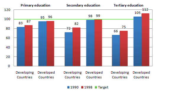
The bar chart shows the number of girls per 100 boys enrolled in different levels of school education in developing and developed countries. Figures are given for 1990 and 1998.
It is clear that both developing and developed countries have higher amount of girls in 1998 than 1990 no matter what levels of school education is. Compare to each level of school educations, developed countries have lesser gap between 1990 and 1998 than developing countries. For example, in primary education, developed countries have only 1 difference between 1990 and 1998 but developing countries have 5 difference.
For developed countries, the number of girls increases as the levels of school education go higher for both in 1990 and 1998. Conversely, for developing countries, the number of girls decreases as the level of school education go higher.
Only developed countries in tertiary education level at both 1990 and 1998 year has higher than 100 boys which is the target of the chart.

 댓글 0개
댓글 0개


 불편사항 신고