


 인쇄
인쇄


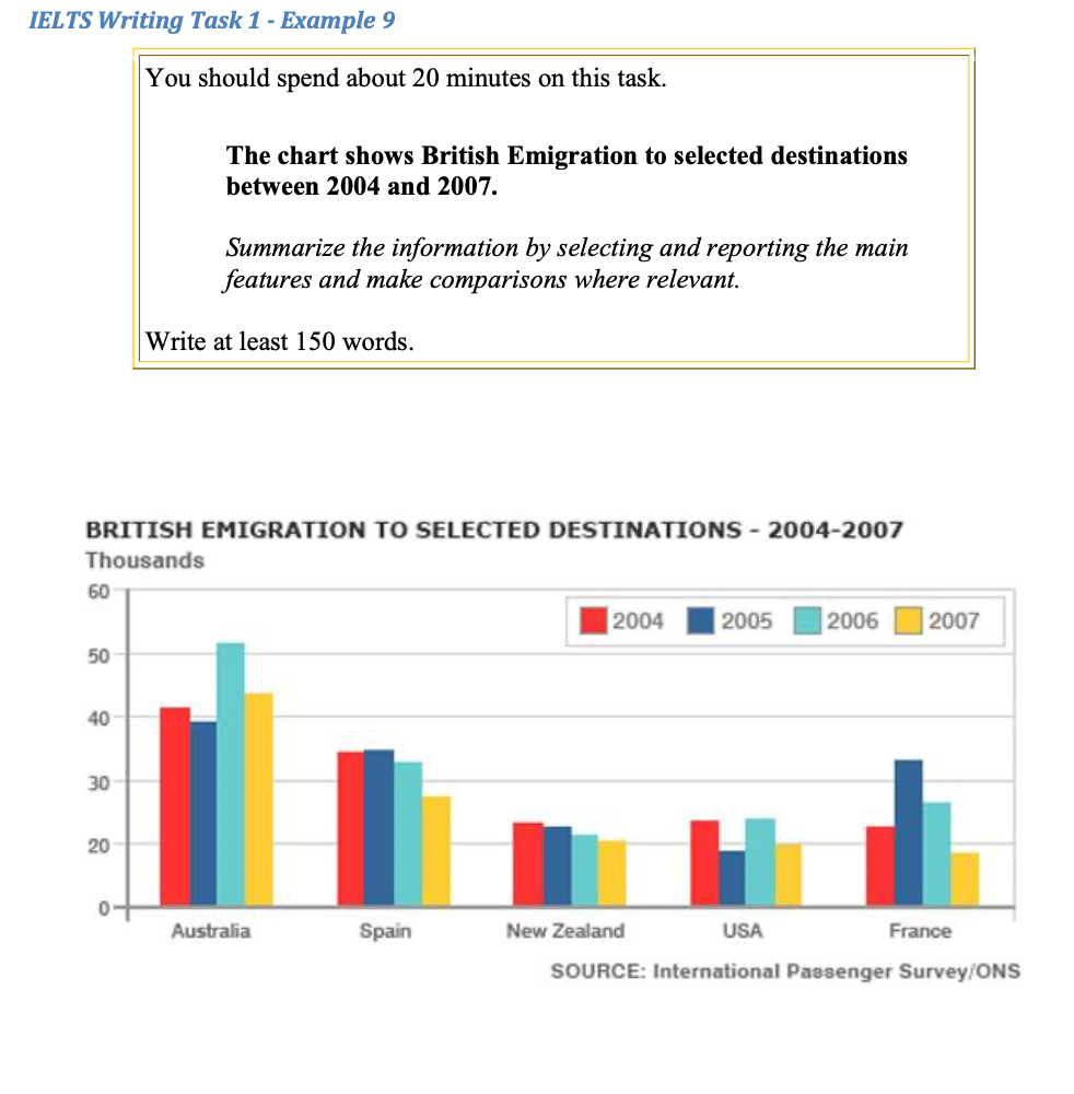
This graph illustrates how many people left Britain to live in another country from 2004 to 2007. There are five destinations in this chart above which are Australia, Spain, New Zealand, USA and France. (이런 거 안 써도 됩니다.) Overall, Australia was the most preferable country in the options and Spain was at the second place in every single year for four years.
According to the survey above, the most British population emigrated in 2005 where approximately one third of the emigrants went to Australia. To be specific, the number of people who moved to settle in Australia in 2006 was over 50 thousands.
In comparison among these countries, New Zealand was the only country where the number of immigrants from Britain was gradually decreasing without any exception. (얘는 윗 문단과 합쳐주시면 됩니다.)
There is a remarkable increase in France in 2005. Compared to the figure in 2004, there was a were noticeable augment in 2005; to be specific, about 23 thousands in 2004 to around 33 thousands in 2005. There is are another rapid increase in accordance with the chart. There was a gap of over 10 thousand were over 10 thousands figure gap between 2005 and 2006 in Australia. (181 words)
총평: (7/6/7/6) 6.5
지금도 나쁘지 않긴 한데, 사실 초코팅촉님 실력에 비해 조금 아쉽긴 합니다. 단위 관련해서 s가 들어가지 않는 건 학생들이 되게 많이 틀리는 사항이니까 잘 체크해주세요!
수고하셨습니다 :)

 비밀번호 확인
 댓글 0개
댓글 0개


 불편사항 신고