


 인쇄
인쇄


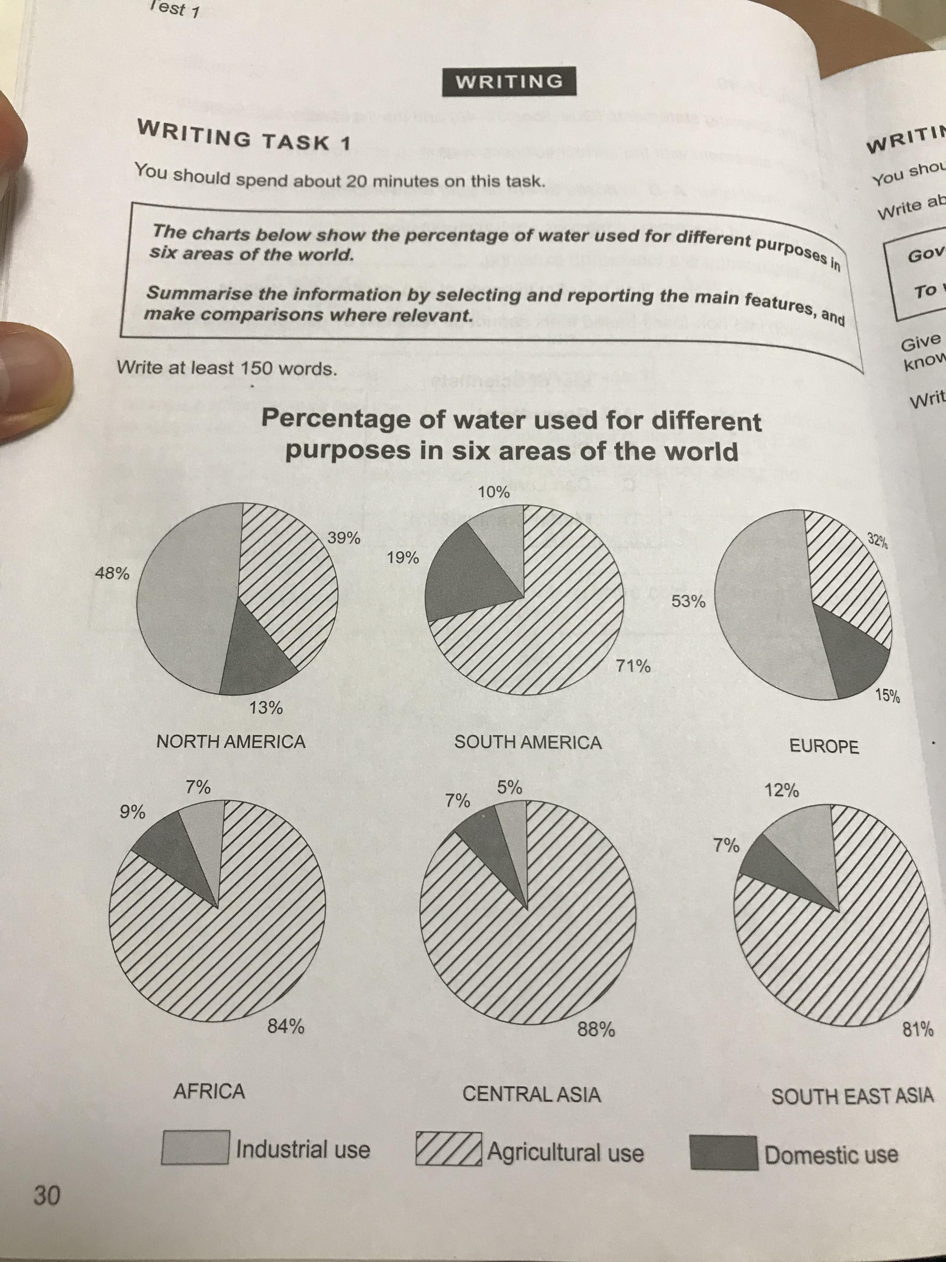
The pie charts above indicate the amount rate (양과 비율은 전혀 다른 개념입니다.) of water employed for various reasons among six places in the world.
Generally speaking, there is clearly it is clear to understand that the people in South America, Africa, Central Asia and South East Asia were interested (task1은 주관적인 해석 없이 객관적으로 가는 게 중요합니다. 이 표의 경우 단순 사용 비율만 보여주고 있기 때문에 그냥 사용 비율이 높았다고 하면 되지, 이를 흥미 혹은 밑의 accustom 등으로 자의적인 해석을 해서는 안 돼요.) in using water for a agriculture and the other people in North America and Europe were acustomed to using water for a industry.
Through these charts given, in Central Asia, Africa and South East Asia, the ratios of agricultural use were outstanding compared to than those of both industrial use and domestic use. Unlike those percentages, between North America and Europe, the people usually used water for industrial use at 48% and 53% respectively, and they did for domestic use at each 13% and 15%. On the other hand, the rate of agricultural use is higher than that of industrial use in South America, such as the former 71% and the latter 10%. The gap between them is approximately 7 times.
As a result, from these charts, the rate of agricultural use was superior to those of both industrial and domestic use in South America, Africa, Central Asia and South East Asia, the people in North America and Europe prefered to use water for a industry rather than both a domestic and agricultural use. (앞에서 했던 말입니다. 그저 분량 채우기에 불과해요.)
총평: (6/6/6/7) 6.5
task2와 마찬가지로, lukas님은 task1에 있어서도 단순 요령 부족이며, 이 요령만 익혀주시면 충분히 7점이나 7.5까지는 괜찮습니다. 표이든, 지도 등이든 분석할 때 최대한 자의적인 해석이나 단어는 넣지 않도록 주의해주시고, (이게 잘 되면 상관이 없지만, 잘못되었을 때의 리스크가 더 크며, 일반 수험생이 이걸 잘 구분하기는 쉽지 않을 겁니다.) 이번 글은 구조 관련해서도 수정이 필요합니다.
서론-Overview 다음에 두 개의 문단을 더 넣으시면 되는데, 이때 첫 번째 문단에는 북미-유럽의 공통점 및 차이점을, 두 번째 문단에는 나머지 4지역의 공통점 차이점을 넣으시면 됩니다.
수고하셨습니다 :)

 비밀번호 확인
 댓글 0개
댓글 0개


 불편사항 신고