


 인쇄
인쇄


우선 문제 화질이 안좋아서 죄송해요. 아이엘츠 공부 막 시작해서 task 1 처음 써봤는데 첨삭 부탁드립니다!
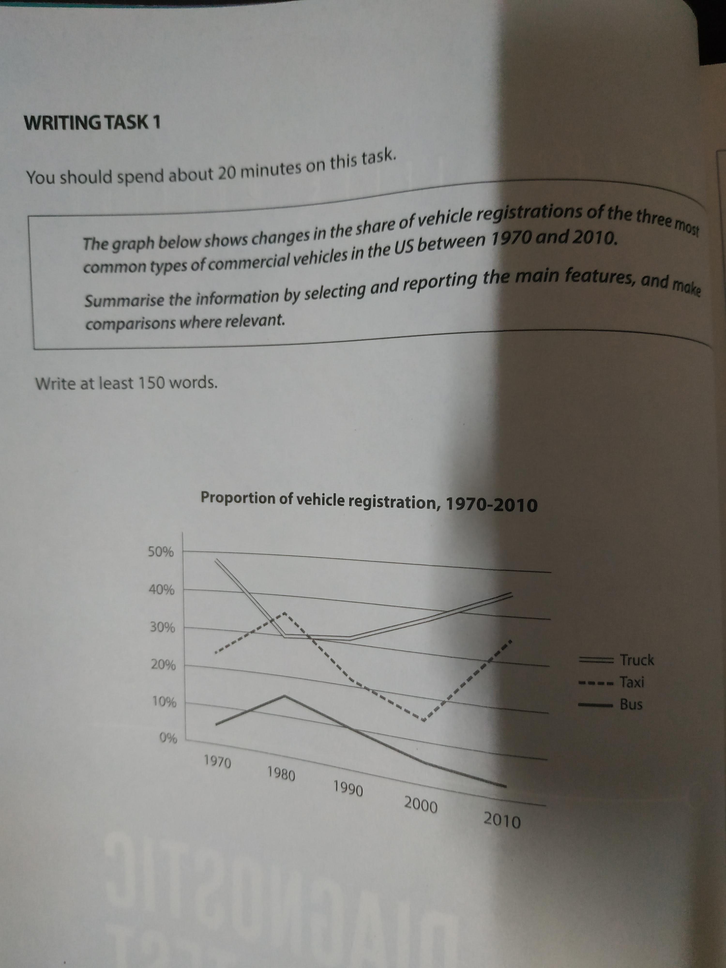
The line graph compares the proportion of the three most common types of commercial vehicles in US between 1970 and 2010.
It is clear that the truck is the most popular type of commercial vehicles in US. The proportion of using trucks stuck with the highest except in 1980. The lowest figure on the chart are for the bus. The proportion of bus peaked at 15 per cent in 1980, before start falling steadily. It kept shows the lowest proportion from 1970 to 2010.
The proportion of using taxi was the second highest in 1970, but it overtook truck and became the highest. The proportion of taxi gradually decreased from 1980 to 2000, so it returned to the second highest again after 1970, but this category also saw dramatic increase from 2000 to 2010 by 15 per cent to 35 per cent.
In 2010, the truck achieved the highest proportion by 45 per cent. The taxi showed the second highest proportion by 35 per cent and the bus revealed the lowest in the figure by less than 5 per cent.
(180 words)

 댓글 2개
댓글 2개


 불편사항 신고