


 인쇄
인쇄


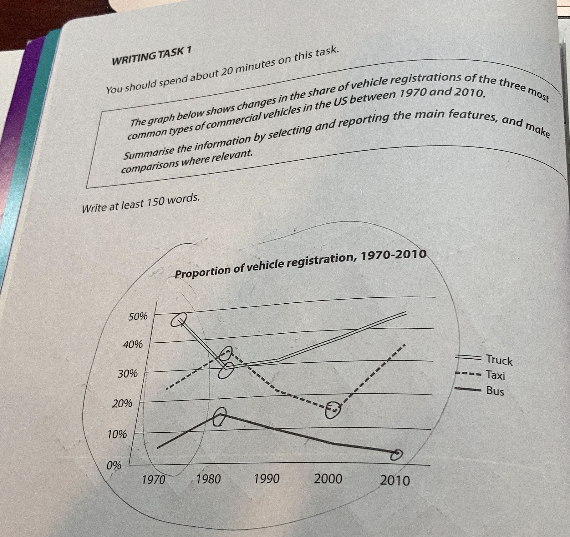
This graph indicates the mutation in the share of the three most common types of commercial vehicles' registrations in the US over a 40 years of period. (일단 문법만 고쳐드리면 이렇게 되는데, 여기의 경우 실제 연도를 넣는 것도 좋습니다.)
Overall it is evident that all three vehicles' share has fluctuated significantly. Albeit the shares have changed a lot, Truck (여기 포함 세 항목은 싹 다 소문자 시작해주시면 됩니다. 문단의 첫 단어로 쓰이는 경우를 제외하고요.) made up the most share, following up by Taxi and then Bus hit the lowest share in 2010.
Looking at the graph more specifically, generally, Truck has the most share at approximately 50 percent in 1970. But (문장을 and but so로 시작하는 것은 좋지 못합니다.) it plummeted by to (표 문제에서 by와 to의 구분은 정말 중요합니다.) 30 percent which is almost a 20 2o percent point decreased in 1980. Once it hit 30 percent, it began to increase again by over 40 percent in 2010. Furthermore, Taxi has surged nearly 10 percent points in rate in 1980 and rapid reproduction from 1980 to 2000 (이 표는 생산과 아무런 관련이 없습니다~). After that, It it increases again to over 30 percent. Meanwhile, Bus, which had the lowest share of vehicle registrations, increased by 10 percent points at the beginning. But to that end, It it gradually declined even lower than 5 percent over the course of the next 30 years.
처음이라 어색한것같아요
총평: (6/6/6/6) 6.0
task1에서 처음인데 이정도면 그래도 잘 써주신 편입니다.
꺾은선 그래프에서는 수치 간 역전을 다루는 게 매우 중요한데, 여기의 경우 80년대를 전후로 트럭과 택시 간 역전이 보이니까 그걸 분석의 포인트로 잡아서 적어주시면 돼요.
수고하셨습니다 :)

 비밀번호 확인
 댓글 1개
댓글 1개


 불편사항 신고