


 인쇄
인쇄


The graph above compares the number of visits to two new music sites on the web.
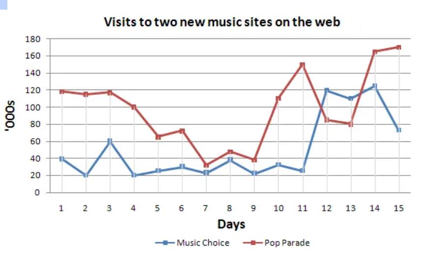
The provided graph compares how many users visited two new music online websites named ‘Music Choice’ and ‘Pop Parade’ within two weeks.
Overall, all graphs showed a noticeable fluctuation within particular days. Users who visited Music Choice were always fewer than the number of visits to Pop Parade excluding the 12th and 13th days.
Turning to the details, a gap in the number of guests who visited those websites between the consecutive dates kept changing irregularly. It was almost the same only from the 7th untill the 8th day as 10,000 people. Although this difference was significant for the first four days, it started to fall fell considerably down from 5th to 9th day. In this period, Pop Parade showed a bigger decline than Music Choice in number, whereas the number of visits to Music Choice shifted slightly.
The flow of the graph became interesting from the 9th day. A significant rising tendency of visitors to Pop Parade was shown during two days from the 9th day. On the 14th day, Pop Parade succeeded to lead the largest number of 150,000 people to access their website, following by showing a decline from the second-highest figure on the 11th day. Even though Music Choice marked the highest figure of visitors as 120,000 on the 14th day, it decreased on the final day after all.
총평: (8/7/7/7) 7.5
일정한 경향이 보이는 표는 아니라 조금 까다로울 수도 있었는데 잘 대처해주셨네요. 특히 두 수치 간 역전이 이루어지는 시점을 캐치해주신 게 좋았습니다. 무조건 7.5가 확보될 것이라고는 말씀드릴 수 없겠지만, 이정도면 시간 문제가 없다는 전제 하에 7.0은 무조건 받으시니까 시간만 잘 맞춰주세요!
수고하셨습니다 :)

 비밀번호 확인
 댓글 0개
댓글 0개


 불편사항 신고