


 인쇄
인쇄


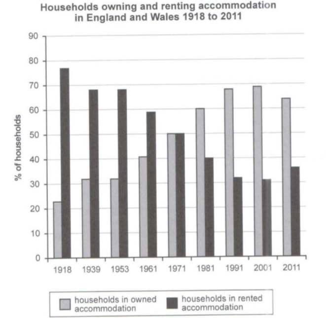
This bar chart illustrates the percentage
of households in owned and rented accommodation in England and Wales between
1918 and 2011. Overall, as a whole, the percentage of households in owned accommodation
increased and the other while the other decreased throughout the period considerably.
(이번 글의 경우도 제가 나눠드린 것처럼, 엔터는 두 번 치거나 아예 치지 않습니다.)
At the beginning of the period, the
percentage of households in rented accommodation far exceeded the percentage of
households in owned accommodation. Over the following 53 years, the percentage
of households in owned accommodation increased and the percentage of households
in rented accommodation declined continually.
In 1971, the two figures were perfectly equal
to each other. After 1971, over 30 years, the two figures showed the same
consistency to the past 80 years.
In the final year, the percentage of
households in owned accommodation dropped a little bit while and the percentage of
households in rented accommodation showed a subtle increase. However, the
percentage of households in owned accommodation remained far ahead of the
other.
첨삭 부탁드립니다! 감사합니다 :)
총평: (6/6/6/6) 6.0
이번 글의 경우 크게 두 가지 부분의 문제가 있습니다.
먼저, 분석을 할 때에는 구체적인 수치가 가미되어야 합니다. 그러나 이번 글은 그러한 수치 없이 그저 일반론적인 얘기만 하고 있기 때문에 적절하지 않죠.
또한 현재 글은 the percentage of ~~의 문장으로만 모든 글을 처리하고 있기 때문에 이에 대한 대체도 필요합니다. 표현 자체는 물론, 문장 구조에 대한 패러프레이징을 꼭 해주세요~
수고하셨습니다 :)

 비밀번호 확인
 댓글 0개
댓글 0개


 불편사항 신고