


 인쇄
인쇄


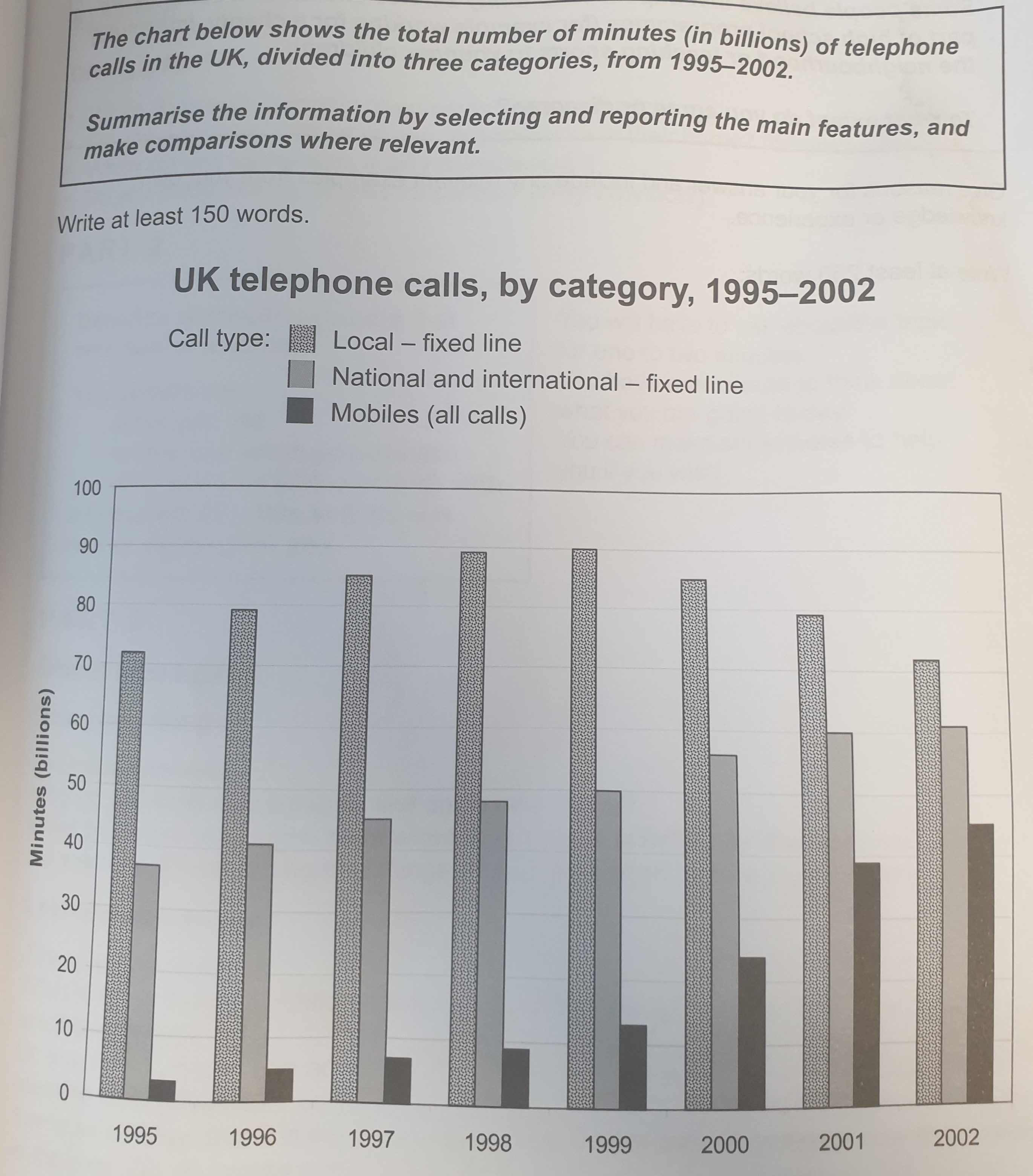
The given bar chart illustrates the change of UK telephone calls(minutes) in 8 years from 1995 to 2002. These calls are categorized into three types: local, national and international, and mobiles.
Overall, it can be seen that local calls account for the highest portion, followed by national&international and mobiles. However, local calls started to decline since 1999, while national&international and mobiles steadily increased. Eventually, the gap narrowed significantly in 2002, the last year.
Taking a closer look at the graph, one can see that local calls first started at about 70 billion minutes and hit a record high of 90 billion in 1999. Since then, it declined and returned to roughly 70 billion level in 2002. The national&international-the second highest proportion- began with 3.8 billion minutes in 1995 and increased to 60 billion in 2002. It increased steadily and grew approximately 1.5 times. Lastly, looking at the figure of mobiles, it showed the greatest growth even though it was the smallest percentage. To be specific, it was just 3 billion minutes in 1995, while it recorded about 45 billion in 2002. It is a nearly 15 times increase. These three types of numerical gaps were the largest in 1999, while they were gradually smaller and showed the smallest in 2002.
(목표점수 7.0 감사합니다^^)

 댓글 0개
댓글 0개


 불편사항 신고