


 인쇄
인쇄


제목 : The graph below show the number of public transit passenger from 1989 to 2009 and bus and tram passenger numbers between 2000 and 2008 in Melbourne.
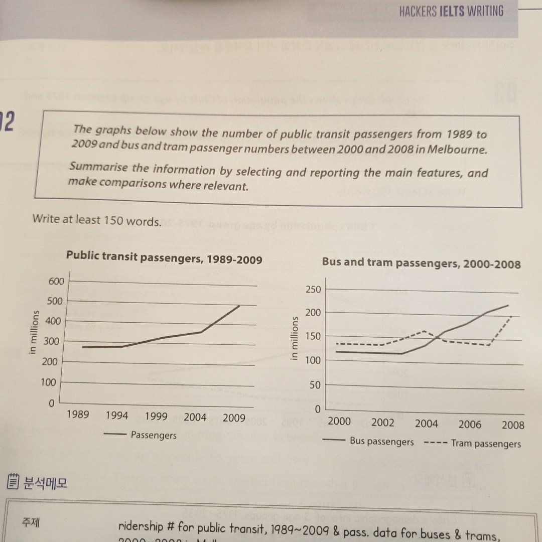
The given line graph illustrates how many people used public transit between 1989 and 2009 or bus and tram from 2000 to 2008 in Melbourne.
As an overall trend, it is clear that the figures of all types of vehicles significantly increased for the given period of time. In the midst of two different graphs, passengers of public transit showed the biggest growth from 1989 to 2009, compared to other types of transportation.
A detailed look at the given graph reveals that the number of people who used public transit considerably rose by around 200 millions from under 300 millions to 500 millions during the 10-year-period.
In addition, the statistics of bus passengers showed a steady upward trend between 2000 and 2008 and had a rise of 100 millions, apart from the year from 2000 to 2003, where there was no change. On the other hand, when it comes to tram, the figure slowly went up until the year 2004, and it had a decline of 20 millions for about 3 years. However, it climbed at 200 millions, which was the greatest incline than any other graphs.

 댓글 0개
댓글 0개


 불편사항 신고