


 인쇄
인쇄


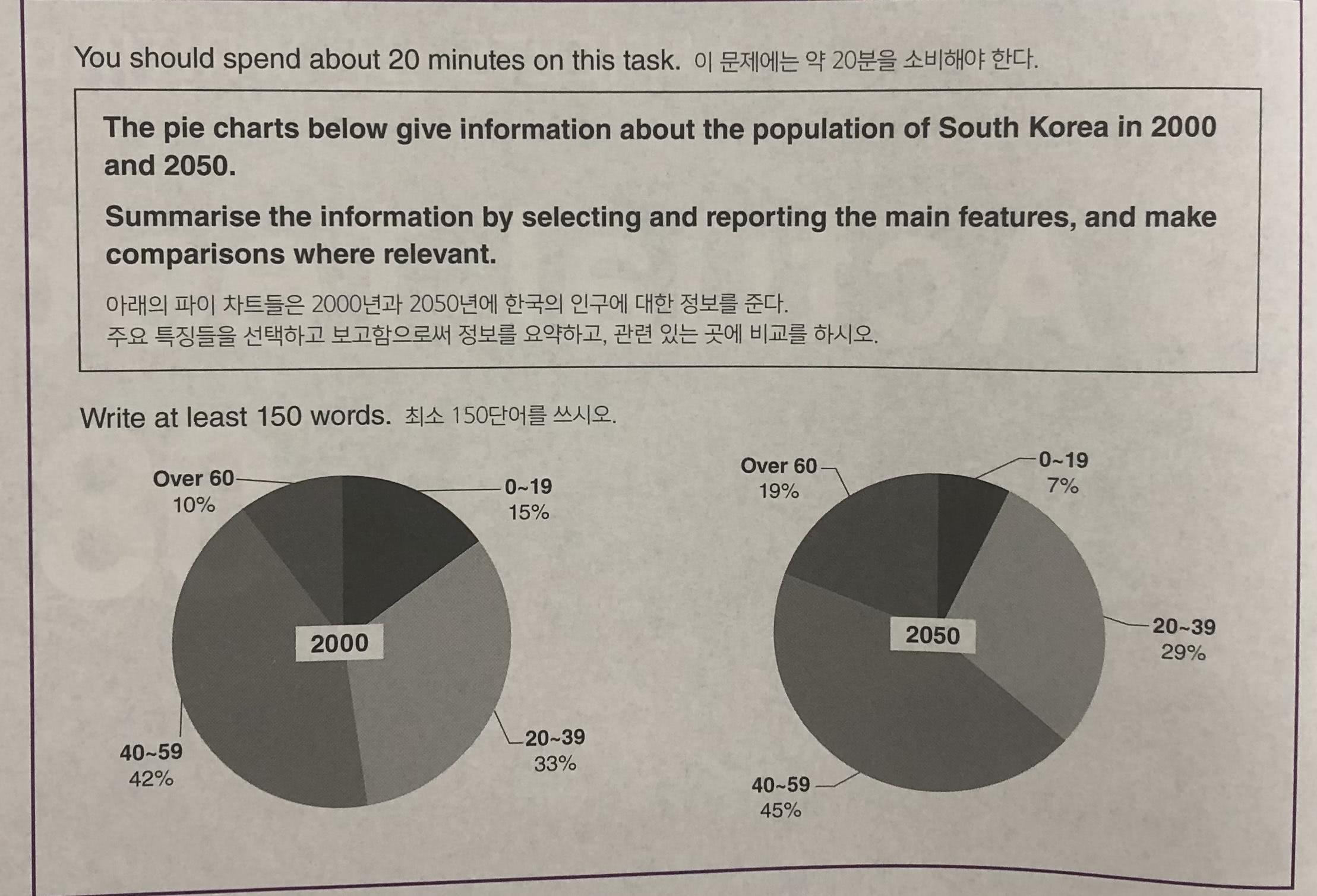
The chart below is concerning an presents information about the comparison of population in South Korea between 2000 and 2050.
Overall, the main change of proportion in population is expected in the youngest and the oldest groups. There is a nearly twice two times difference on the figures of the two groups in 2000 and 2050.
Firstly, the group of people in their 40s and 50s has the largest portion of the population in 2000 and 2050 (지금처럼 미래의 자료가 제시될 경우, 시제 역시 이에 맞춰주셔야 합니다. 마지막 문단의 경우 이게 잘 된 반면, 이 문단은 안 되어있으므로 수정해주시면 되겠습니다.)). The figures are 42% and 45%, respectively. In contrast, although the group of 20s to 30s accounts for the second large portion in the two charts, the figure declines from 33% to 29% between 2000 and 2050.
Moreover, there is a huge difference of proposition of population in 2000 and 2050 for the youngest and the oldest groups. The figure of a range over 60 years old in 2050 is estimated to be nearly twice times more than that in 2000, while the percentage of a the group under 20years old in 2050 is speculated to be less than half of the figure (지금 figure가 주구장창 쓰이고 있기 때문에 대체가 필요합니다. 이에 대해서는 총평에서 말씀드릴게요.) in 2000.
비교 집단으로 나이가 숫자로 표기되어 나올 때 항상 각 그룹을 어떻게 지칭해야하는지 고민하게돼요.
따로 방법이 있다면 알려주세요!
오늘도 첨삭 감사합니다:)
총평: (6/7/6/6) 6.5
이번 표에 한해서 시제는 TA와 GRA에 동시에 들어가므로 특별히 더 주의해주셔야 합니다.
표기법에 대해 질문해주셨는데, 제가 일단 예시로 people in their~~로 바꿔드리긴 했으나, 저게 유일한 정답은 아니기 때문에 더더욱 모범답안의 역할이 중요해집니다. 모범답안을 보면서 해당 답안이 항목을 어떻게 표시했는지를 확인하고 분석해서 내 것으로 만드는 작업이 정말 중요해요. task1은 모범답안 분석으로 정말 많은 도움을 받을 수 있으니까 잘 활용해주세요!
수고하셨습니다 :)

 비밀번호 확인
 댓글 0개
댓글 0개


 불편사항 신고