


 인쇄
인쇄


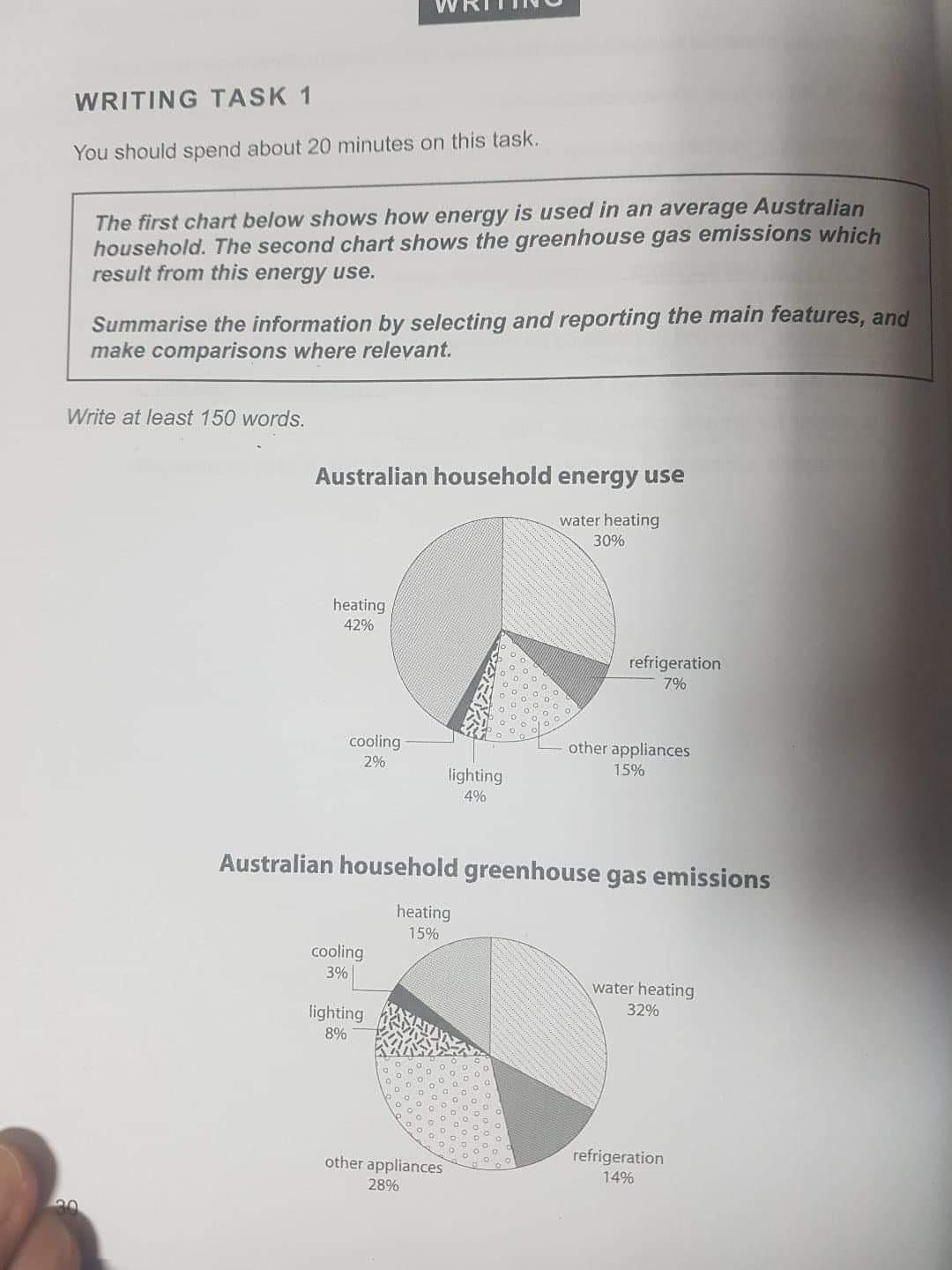
The first chart indicates an average of energy used energy use in an average Australian household. With this chart it is able to realize the differences about energy use.
As you (2인칭은 구어에 해당하기 때문에, task1,2 상관없이 쓰지 않는다고 보시면 됩니다.) can see heating which shows 42%, is the biggest energy use of others. Water heating then follows the energy use with 30%. In contrast, refrigeration and lighting is showing 7% and 4% which figures are is lower than the aforementioned ones I’d mentioned above. Cooling indicates the lowest energy use in Australian household which is 2%. Except these, energy use of other appliances is 15%.
The second chart indicates Australian household greenhouse gas emissions which result from energy usage chart above.
Greenhouse gas emissions are showing slightly different average with the article compared with energy use. Water heating releases the most greenhouse gas emissions which was not the case for most energy use. In contrast, heating indicates less than half of the water heating. Refrigeration shows 14% which is similar average with the heating. Cooling in greenhouse gas emissions indicates the lowest average among others, as it was the lowest (바로 앞에 같은 단어가 있으므로 대체해주시는 게 좋습니다.) energy use.
총평: (5/6/6/6) 6.0
우선 task1 작성에 대한 어느정도 요령을 익히는 것이 중요합니다. 이 표를 다룰 때 문단 구조는 서론-Overview-표1-표2의 4문단을 갖춰주시면 되며, 이때 서론에서 두 표에 대한 소개를 동시에 해주시면 됩니다. 작성 요령에 대해서는 모범답안과 다른 학생들의 글을 참고해보시는 것도 좋을 것 같고, 또한 저도 링크를 하나 넣어드릴테니 참고해주세요~
수고하셨습니다 :)
https://www.gohackers.com/?c=ielts/ielts_info2/ielts_writing&type=url&uid=461474

 비밀번호 확인
 댓글 0개
댓글 0개


 불편사항 신고