


 인쇄
인쇄


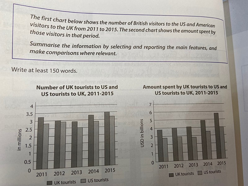
The first bar graph shows the number of UKtourists to US and US tourists to the UK from 2011 to 2015, and the second oneindicates the amount spent by them.
According to the first graph, it is clearthat the number of UK visitors to the US are more than US visitors to the UKduring 5 years in question. The number of UK tourists to the US slightlydecrease from 2011 to 2013, and then it rises from 2013 to 2015 reaching thehighest point of 3.5milions in 2015. However, the number of US tourist to theUK peak at over 3 million in 2015. The gap between two countries narrowed from 2011 to 2015,but soon widened in 2013.
In the second graph, it is apparent that UKtourists annually paid more than US tourist. For UK tourists, it continuallyincreased and reach a peak of almost $6 billion in 2015. The amount spent by UStourists remained almost constant between 2011 and 2013, but begin to ascend in2013.

 댓글 0개
댓글 0개


 불편사항 신고