


 인쇄
인쇄


제목 : The graph below show the number of public transit passenger from 1989 to 2009 and bus and tram passenger numbers between 2000 and 2008 in Melbourne.
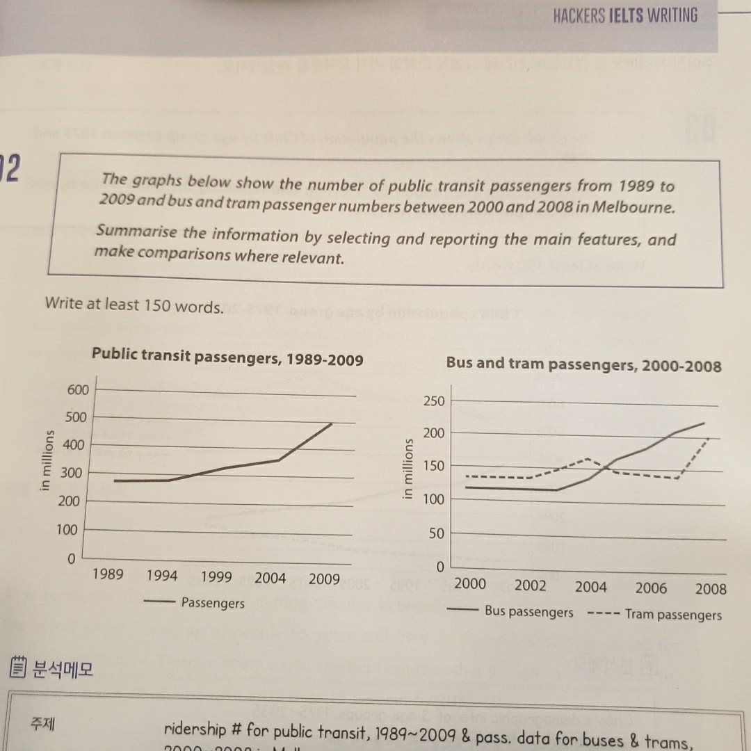
The given line graphs illustrates how many people used public transit between 1989 and 2009 or bus and tram from 2000 to 2008 in Melbourne.
As an overall trend, it is clear that the figures of all types of vehicles significantly increased for the given period of time. In the midst of two different graphs, passengers of public transit showed the biggest growth from 1989 to 2009, compared to other types of transportation.
A detailed look at the given graph reveals that the number of people who used public transit considerably rose by around 200 millions (이거 학생들이 정말 많이 틀리는 사항이므로 주의해주셔야 합니다. 단위가 표에 주어진 그대로 가서는 안 되는 경우도 많으니까 잘 신경써주셔야 해요.) from under 300 millions to 500 millions during the 10-year-period. (여기서 엔터 한 번 더 치시면 됩니다.)
In addition, the statistics of bus passengers showed a steady upward trend between 2000 and 2008 and had a rise of 100 millions, apart from the year from 2000 to 2003, where there was no change. On the other hand, when it comes to tram, the figure slowly went up until the year 2004, and it had a decline of 20 millions for about 3 years. However, it climbed at 200 millions, which was the greatest incline than any other graphs. (꺾은선 그래프에서는 수치 간 역전을 다루는 게 중요합니다. 예를 들면 이 표의 경우 04-06년 간에 이루어지는 역전을 다뤄주시면 돼요.)
총평: (6/6/7/6) 6.5
위에서 말씀드린 단위를 정확하게 갖추는 것, 그리고 수치 간 역전은 Task1에서 모두 중요한 사항이므로 꼭 체크해주시고 다음 글에도 반영해주시면 도움이 될 겁니다.
수고하셨습니다 :)

 비밀번호 확인
 댓글 0개
댓글 0개


 불편사항 신고