


 인쇄
인쇄


The graph below gives information about changes in the birth and death rates in New Zealand between 1901 and 2101. Summarise the information by selecting and reporting the main features, and make comparisons where relevant. Write at least 150 words.
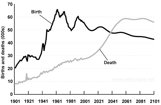
The given line graph illustrates the rates
of birth and death in New Zealand from 1901 to 2101.
Overall, it is clear that there is a frequently
changed in both birth and death rates between 1901 and 2001. After 2041, the
latter one will be reversed.
According to the given graph, there were
more births which accounted for twice the mortality rate, slightly over 20,000.
Even though it decreased steeply, the rate climbed continuously to reach a high of
around 65,000 by 1961. On the other hand, in the same period, unlike the birth
rate, its trend showed the less fluctuation, about from 9,000 to 29,000 than another one. Thus, there
was a big gap between the birth and death rates.
Over the 40 years period, the death rate began
to increase with the plunging rate of birth by 2041, they are expected to meet in
approximately 49,000. The former one is predicted to surpass the latter one steadily
and peak of 59,000 in 2061. Meanwhile, an average of 45,000 people are predicted
to be born from 2041 to 2101.
목표점수:7.0
글자수:177자
소요시간:측정안함
외부도움:없음
시험예정일:미정

 댓글 0개
댓글 0개


 불편사항 신고