


 인쇄
인쇄


Q ; The line graph shows the percentage of New Zealand population from 1950 to 2050. Summarize the information by selecting and reporting the main features and make comparisons where relevant.
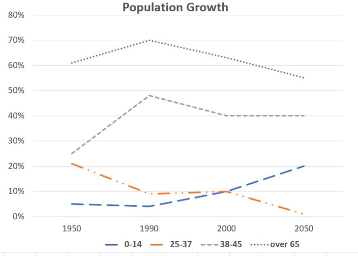
The line graph illustrates the rate of population in different age groups of New Zealand how many people who are classified with various age groups in New Zealand with a proportion of population from 1950 to 2050.
In general, the oldest group which is over 65 takes up to the highest rate in this graph, while however, for people who are aged to 37, these two lines are relatively lower than others.
With regard to this figure, in 1950, the group aged over 65 demonstrates the first place by 60%. Furthermore, this proportion peaked up to 70% in 1990 and remained this place in this graph despite diminishing since then. In terms of the other group which is aged 38 to 45, there was a rise to 1990 by jumping to nearly 50% from below 30%. However, this percentage minimized to 40% (최소화라고 할 수는 없습니다. 이미 그 이전에 최소치를 찍었기 때문이죠.) and remained a stable state to further years.
On the other hand, in the two groups of people aged 0 to 14 and 25 to 37, there are fluctuations between them. At first, the proportion of 0 to 14 was the lowest group in this graph by below 10%, but, this line is estimated to reach 20% in 2050. In addition, in 2000, these two lines are reversed together and that is why the percentage of 25 to 37 is expected to drop to the bottom.
총 214단어
22분
총평: (7/6/6/6) 6.5
시험 잘 치르고 오셨나요? 시간이 조금 넘어간 건 아쉽지만, 그래도 시험에서 지금처럼 최대한 덜 틀리는 식으로 쓰셨으면 충분히 가능성이 있을 겁니다. 좋은 소식 기대하겠습니다!
수고하셨습니다 :)

 비밀번호 확인
 댓글 0개
댓글 0개


 불편사항 신고