


 인쇄
인쇄


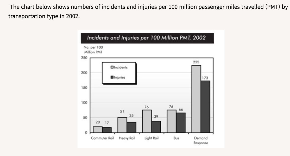
The given bar graph describes statistical information about the incidents and injuries per 100 million passenger miles travelled by the five distinct types of transportation in 2002.
Overall it seems that the figure of accidents and injuries of demand response was overwhelmingly high among the given chart. All types of transportations had a higher number of incidents than injuries.
Looking at the graph more closely, one can see that a demand response transportation, such as taxi, reached the highest number, which is the only one that surpassed 200 and 100 per 100 million PMT (이거 넣어주셔야 합니다. 그렇지 않을 경우 의미가 완전히 달라져요. 그래도 밑에는 들어가서 다행입니다.), in incidents and injuries respectively. When comparing a heavy and a light rail, although the light rail had slightly higher statistic in both incidents and injuries, interestingly they shared similar numbers in injuries. It is noticeable that buses recorded the second-highest number in injuries, by 66 per 100 million PMT, while the number of incidents was the same as the light rail. It is noteworthy that the commuting rail has a relatively low rate of accidents and people who were injured.
wc: 169
시간: 15분+ 2분검토
총평: (7/7/7/7) 7.0
이정도면 충분히 잘 써주셨습니다. 단위 정도만 빼먹지 않도록 주의해주시면 될 것 같아요. 나머지는 괜찮았습니다. 최근들어 다시금 기복이 없어지고 있다는 점이 매우 긍정적이네요. 그래도 자만하지 마시고 모범답안+문법+어휘는 꼭 매일매일 해주세요!
수고하셨습니다 :)

 비밀번호 확인
 댓글 0개
댓글 0개


 불편사항 신고