


 인쇄
인쇄


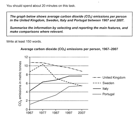
The line graph depicts the amount of carbon dioxide emissions per person each person in different four nations from 1967 to 2007. Overall, the average emission of the UK and Sweden decreased while those of Italy and Portugal inclined throughout the period.
Firstly, at the beginning of the period, it is obvious that people who live in the UK emitted the highest amount of carbon dioxide per person while Portugal was the nation with the lowest least average emission among the four countries. The figures were about 11 metric tonnes and 1 metric tonne, respectively. As time passed, the average emissions decreased gradually in the UK, but while (이건 그냥 암기하시면 편한데, task1 표 문제에서 but 이나 however를 쓸 일은 거의 없다고 보셔도 무방합니다.) the number of emissions in Portugal rose steadily throughout the period. Each figure reached to 9 tonnes and 5 tonnes per person.
Also, it is noticeable that Sweden had fluctuated over the period (바뀌는 건 스웨덴이 아니라 스웨덴의 수치입니다.). Its average emission skyrocketed from 8 tonnes in 1967 to 11 tonnes in 1977, but the figure fell significantly to 7 tonnes in 1987. After this period, the number of emissions decreased gradually between 1987 and 2007. Finally, the figure in Italy was equal to 5 tonnes in Portugal. Meanwhile, the average emission of Italy showed a steady increase, its figure rose from 4 tonnes to 8 tonnes per person during the period.
총평: (7/7/6/6) 6.5
nallalee님의 경우 이전에도 강조드렸듯이 task1에 더 집중해주시면 됩니다. task2는 어느정도 안전궤도에 올라와있는 반면에 task1은 아직 표현상 미흡하니까, 모범답안을 많이 보셔서 해당 답안이 같은 내용이더라도 어떤 식으로 패러프레이징했는지를 주목해주세요!
수고하셨습니다 :)

 비밀번호 확인
 댓글 0개
댓글 0개


 불편사항 신고