


 인쇄
인쇄


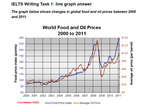
The line graph depicts the information about global food and oil prices from the year 2000 to 2011. In overall Overall (이건 그냥 암기하세요!), the records of food and oil costs showed similar trends. (비슷하다~라고만 쓰는 것은 반쪽자리 답안이 됩니다. 어떻게 비슷한지를 작성할 수 있어야 해요. 또한 표의 밑에 상관도가 나오므로, 이 역시 반영해주셔야 합니다.)
Turning to the details, as for food prices, the number started at about about 90 points in 2000 and hold straight comparatively to 2004, compared with the others years. In 2004, the figure of eating costs increased, accounting for near 100 points and keep upward patterns to the middle of the year 2005. The level decreased marginally to approximately in 2007 and surged just under 220 points in 2008, the year which showed was the highest level. However, the costs plummeted to as around 140 points and fluctuated in the early of the year 2011 and went up, making up 140 points.
When it comes to oil prices, the level illustrated a steady increased from just over $20 to near $120 during the about 8 years which indicated from the year 2000 to 2008. In 2005 and 2007, the oil graph overtook the food ones. The costs declined significantly to about $80 in 2009 which overtook the food graph again and climbed to around $140 which was the peak.
총평: (6/7/7/7/) 7.0
6.5를 주는 채점관과 7.0을 주는 채점관으로 나뉠 것 같긴 한데, 일단 저는 조금 후하게 쳐서 7.0으로 갔습니다. (6.0이하, 7.5 이상은 절대 안 갑니다.) 최근 들어 task1에서 패러프레이징이 정말 잘 되고 있는 것 같아서 보기 좋네요. 대신 문법은 시험 전날까지 만족 없이 꾸준히 해주세요!
이 글의 경우 Overview만 살짝 바꿔주시면 되겠습니다.
수고하셨습니다 :)

 비밀번호 확인
 댓글 0개
댓글 0개


 불편사항 신고