


 인쇄
인쇄


The chart below shows the value of one countries exports in various categories during 2015 in 2016. The table shows the percentage change in each category of exports in 2016 compared with 2015.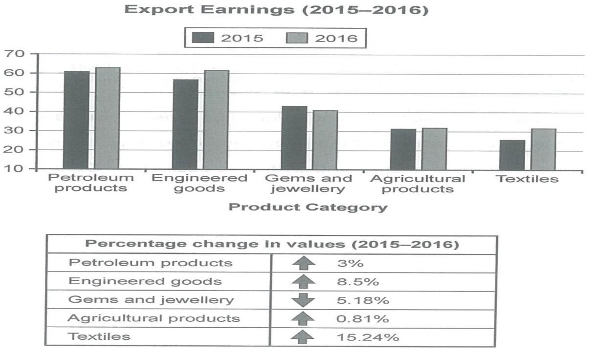
The given bar graph illustrates export earning of one country in five different categories from 2015 to 2016, and the table chart shows that the change of the values in each five sectors, on a percentage basis, in same period.
In the bar graph, it is apparent that export earnings in four categories except in germs and jewellery, which diminished for 2 years, increased from 2015 to 2016. Looking at the graph more closely, although engineered goods was smaller than petroleum products in 2015, export earnings of both sectors were the biggest in 2016. While textiles considerably increased, at roughly 10 billions dollar during the given period, the amount of textiles’ earnings was the lowest over 2 years.
It is clear that, in the table chart, the percentage change in values in textiles was the highest, which was bigger than the figures of all categories combined. In detail, the changes of textiles was at 15.24 percent, which was about as twice as engineered goods at 8.5 percent. Agricultural products increased only less than 1 percent, which was less than half of the figure of petroleum products. In contrast, only germs and jewellery dropped 5.18 percent during 2 years.
-----------------------------------------------------------------------------------
해커스 책에서 2개 차트가 나오면 각각 기술하라고 해서, 각각 기술했는데요-
이 경우에는 2의 표가 1의 표의 변동을 설명하는 거고, 둘의 경향성이 같으므로 전체 특징을 쓰고,
바디 1에서 가장 주요 특징 각각 수치 변화 및 변동성으로 2개 카테고리를 묶고, 바디 2에서 다른 특징들을 묶고 이런 식으로 쓰는 게 나을까요? 다 쓰고 보니.... 차라리 그게 낫겠다 싶은 생각이 들어서요.

 댓글 0개
댓글 0개


 불편사항 신고