


 인쇄
인쇄


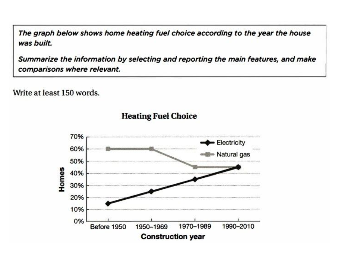
This line graph illustrates the amount of homes which used the heating fuel between electricity and natural gas that is depends on the construction year of houses. In this figure, there are classified with 4 types of year which are started from pre-1950 to 2010.
Overall, it is shown that these two graphs are growing in all of years except the choice of natural gas from 1970 to 1989. Nevertheless of declining the amount of the fuel at home, fifty five percent of houses which consume this fuel remained with same percentage from 1970 to 2010. Furthermore, this graph meet at same point of homes using electricity from 1990.
In further detail, there was only a growth on consuming electricity at home in spite of the highest point of natural gas before 1950. In addition, half of the homes where are constructed from 1990 used double of amount of the fuel which used in house constructed before 1950 at 15 percent.
As the result, the houses which constructed lately tend to use the fuel of electricity, but the demand of natural gas is still going on.
목표점수 6.5
작성시간 25분
총 186자

 댓글 0개
댓글 0개


 불편사항 신고