


 인쇄
인쇄


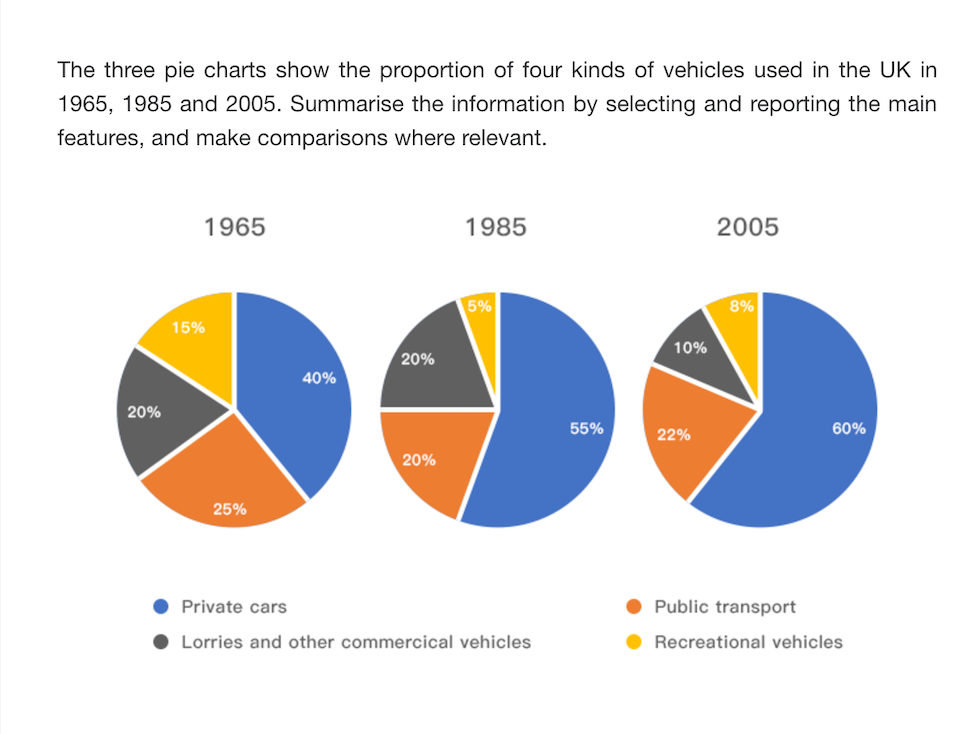
These pie charts demonstrate what vehicles are used in the UK by specific periods.
In overall, it is clear that a majority of people in the UK used more private cars than the other vehicles by over 40% in all periods.
With regard to the first figure, the percentage of vehicles which are public transportation, recreational vehicles and lorries and others are evenly spread by 25%, 20%, 15% each, but, only the number of users of private cars are more than 40% in 1965.
Surprisingly, this proportion grew up to 55% and even soared to nearly 60% from 19854 to 2005. On the other hand, in other sections of vehicles, there are only 5 percent of people who selected recreational vehicles, resulting in the smallest proportion in all three charts. In addition, the number of people with lorries has changed from 20% to 10% by falling half and another group of using public transit stayed below 30% from 1965 to 2005.
총 161단어
20분

 댓글 0개
댓글 0개


 불편사항 신고