


 인쇄
인쇄


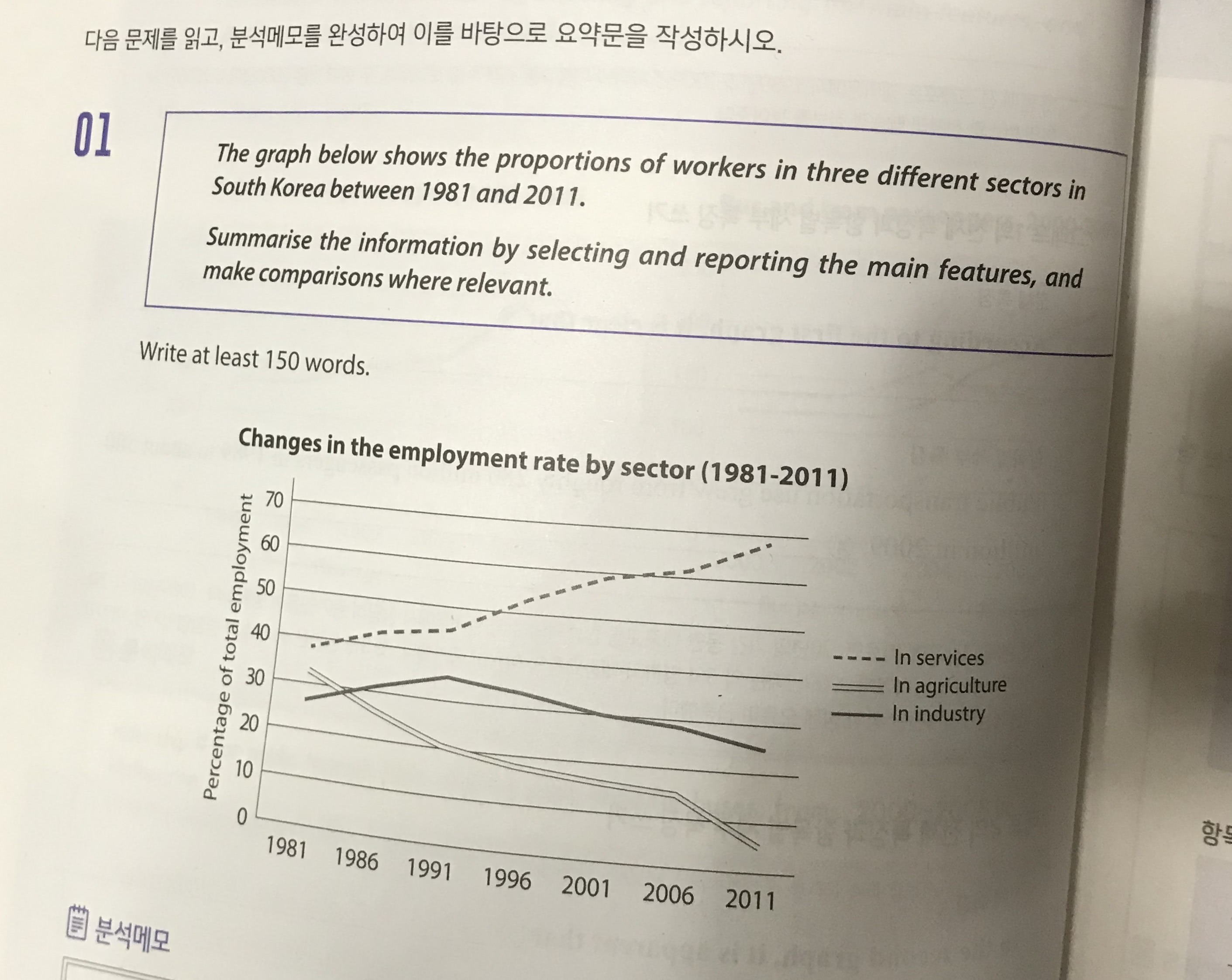
The graph illustrates the percentage of labor population in three types in South Korea from 1981 to 2011.
Overall, it is clear that there was a significant increase in the rate of service. However, in those of agriculture and industry, there were decreasing patterns. (여기서 엔터 한번 더 쳐주셔야 합니다.)
To see the graph more closer, one can see that the figures of services and industry inclined from 1981 to 2001. On the other hand, that of agriculture decreased significantly. From the year 1991, while the percentage of service surged more half of total employment, that of industry started to decline. Likewise, the proportion of agriculture dropped, hitting a low point of well under ten percent in 2011. (이 문단은 이런저런 보완이 필요한데, 밑에서 다 말씀드리겠습니다.)
Finally, the trend will be maintained in the future. The sector of agriculture and industry will be less important. (task1에서는 주어진 수치만 가지고 분석하시면 됩니다. 예측을 하는 건 논제에서 요구한 바가 없어요.)
단어 수: 125 소요시간 25분 목표점수 6.0
단어 수가 많이 모자른데 다른 피드백도 필요해서 올려봅니다..
2주내로 끌어올릴수있을까요?ㅜㅜ
총평: (6/6/6/6) 6.0
2주내로 끌어올릴 수 있을까요? 와 같은 류의 질문을 하는 학생들은 냉정히 말씀드리면 사실 다 답정너여서, 제가 답변을 하는 의미가 크게 없긴 합니다. 설령 제가 끌어올릴 수 없다고 한다고 해서 포기할 것도 아니고요.
물론! 지금 시간만 줄이시고 단어만 확보하시면 충분히 6.0은 받으실 수 있을 걸로 보여요. 고로 너무 걱정하지는 마세요~
제가 표시해드린 문단과 관련해서는 기본적으로 구체적인 수치를 더 추가해주셔야 합니다. ten percent와 같이요. 또한, 꺾은선 그래프에서는 수치 간 역전을 다루는 게 중요한데, 예를 들면 지금 농/산업 간 역전이 81년과 86년 사이에 이루어집니다. 그걸 잘 반영해주시면 돼요.
수고하셨습니다 :)

 비밀번호 확인
 댓글 0개
댓글 0개


 불편사항 신고