


 인쇄
인쇄


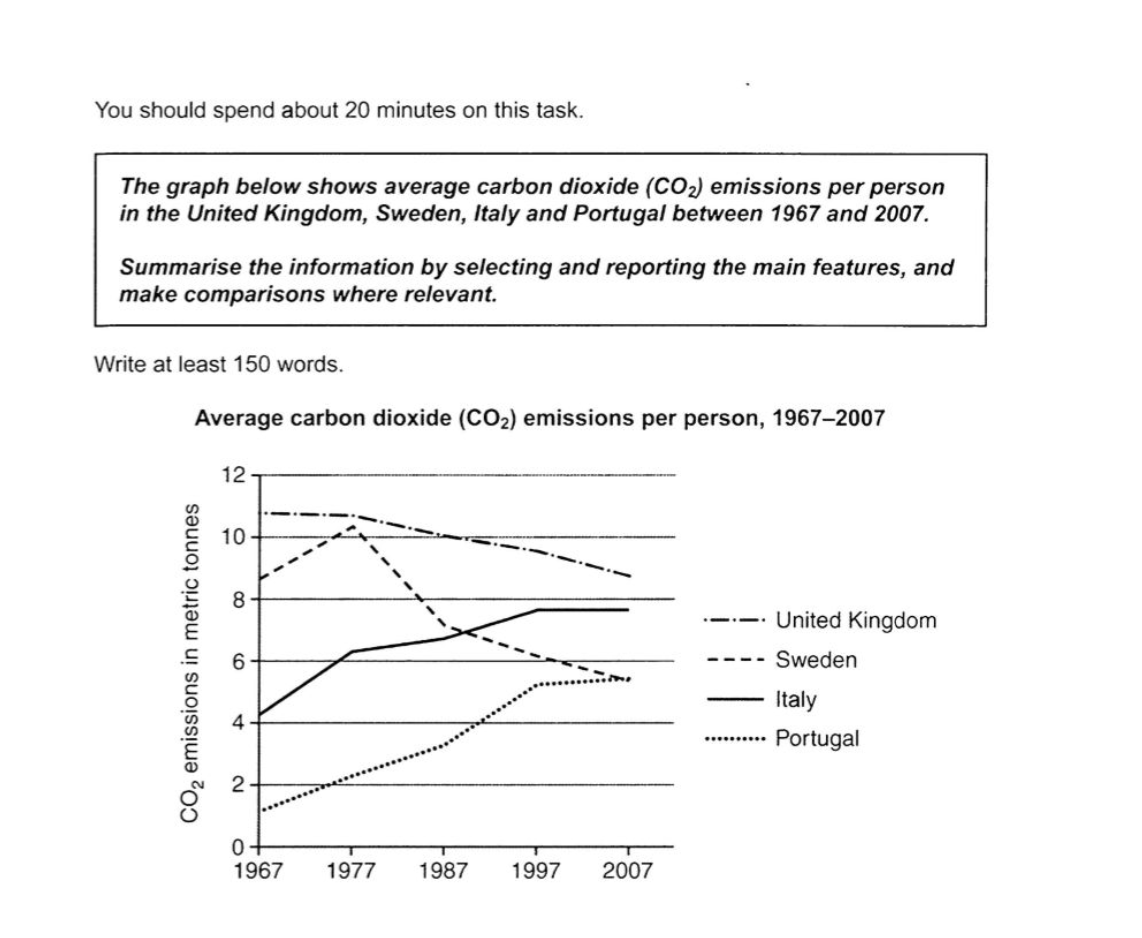
This line graph illustrates how much use carbon dioxide is used in 4 European countries where are UK, Sweden, Italy and Portugal for 50 years. From 1967 to 2007, there are classified with the amount of tones of CO2 emissions.
Overall, it is clear that the largest use of CO2 in several countries is in the United Kingdom at 11 metric (이거 싹 다 붙여주셔야 합니다.) tonnes in 1967. Nevertheless of going down slightly Despite a slight decrease, this graph remained its position of to first place until 2007. Therefore, the figure that Portugal emitted carbon dioxide is gradually getting higher, but still at the bottom. (여기의 경우 앞의 내용과 인과관계로 이어지는 사항은 아닙니다.)
In further detail, there was a turning point with three countries in 1977. According to this trend, in Sweden, they peaked over 11 metric tonnes of CO2. Since then, on the other hand, Afterwards, however, the graph line decreased to 5 metric tonnes without any growth. With regard to other figures, both of them which are Sweden and Italy reversed each other in 1987. (이탈리아의 수치가 스웨덴의 수치를 따라잡았다고 적어주시면 됩니다.)
As the result, the amount of carbon dioxide in all countries was up to 5 tonnes with no under 4 which was the first point of Italy. (이런 식으로 결론처럼 보이는 문단은 따로 쓰실 필요 없습니다. task1은 무조건 Overview 중심이에요.)
목표점수 6.5
시간 22분
총 176단어
총평: (6/5/7/6) 6.0
구조를 다시 잡아주시는 게 좋습니다. 서론-Overview-영국&스웨덴-이탈리아&포르투갈의 4문단으로 잡으시면 되며, 영국과 스웨덴은 감소세 및 기타 특징을, 이탈리아&포르투갈의 경우 증가세 및 기타 특징을 언급해주시면 돼요.
수고하셨습니다 :)

 비밀번호 확인
 댓글 0개
댓글 0개


 불편사항 신고