


 인쇄
인쇄


The chart below shows the percentage of househods in owned and rented accommodation in England and Wales between 1918 and 2011.
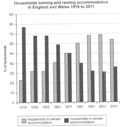
The given bar chart illustrates information on the household figure for owned and rented accommodation in England and Wales from 1918 to 2011.
Overall, it is clear that the two sectors depicted the opposite trend. The the percentage of owned accommodation displayed was an upward trend, whereas that of rented accommodation showed a downward trend, over the given period.
In detail, the ratio of owned accommodation which started at merely about 23% began to show an increase since 1939 to 32% (수치를 임의로 확정지어서는 안 됩니다.). By 1971, people who populated in England and Wales more and more became owners of accommodation, and the percentage accounted for 50%. After 10 years, the percentage recorded a tremendous increase by 10% points. The rate reached a top of close to 70% in 2001.
Moving to the rate of rented accommodation it started at 76 (단위를 생략하지 않도록 주의해주세요!) approximately which was the highest figure in 1918. Between 1939 and 1953, the figure experienced a decreased sharply to 68%. The categories showed steady reduced by 9% (여기는 퍼센트포인트입니다.) for 48 years. In the final year, the percentage made up 37%, which showed the lowest figure during the period. (일단 문법 수정만 하면 이렇게 되는데, 마지막 연도에서 수치가 가장 낮은 게 아니므로 주의해주셔야합니다.)
총평: 이전에 작성해주신 글에 비해 표현상으로나 내용상으로나 훨씬 낫네요. 아직은 어렵겠지만, 다른 표에서도 처음부터 이정도로 쓰실 수 있으면 정말 좋을 것 같습니다. 문법도 오류가 있긴 하나, 가끔 번뜩이는 문장들이 보였다는 점은 긍정적입니다. (그래도 이런 문장들에 절대 집착하지 마시고 정확성을 최우선으로 두어주세요!) 수고하셨습니다 :)

 비밀번호 확인
 댓글 0개
댓글 0개


 불편사항 신고