


 인쇄
인쇄


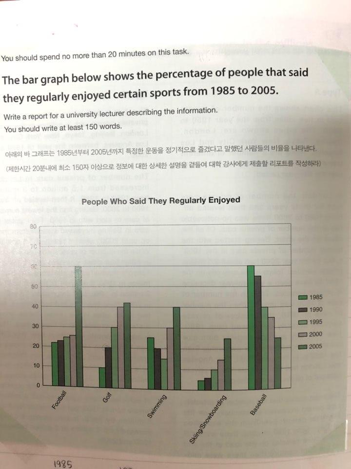
The bar graph illustrates the proportion of types of sports which people regularly enjoyed over in an interval of 20 years. As an overall trend, the categories like football, golf and snow sports were increased, somehow, and the preference’s trend of swimming and baseball was different from 1985 to 2005.
In 1985, the percentage of people who liked to enjoy baseball was the highest among the categories however, it showed a substantial decrease from 60% to 25% at the end of the period. In contrast, the preference for enjoying football was a far higher increment of 60% in 2005, even the previous percentage was gradually upward from 21% in 1985 to 25% in 2000.
Interestingly, the percentage of people enjoying golf had been overtaken by swimming from 1995 to 2005, which the data showed the same as 20% in 1990. For snow sports like skiing and snowboarding, the percentage of population was quite small in 1985 and after that steadily grown up until 2005, which was a similar data with baseball.
The changing preference for swimming in 20 years showed it was started by 25% in 1985, decreasing by 15% in 1995 and then noticeably rose by 40% in 2005.

 댓글 0개
댓글 0개


 불편사항 신고