


 인쇄
인쇄


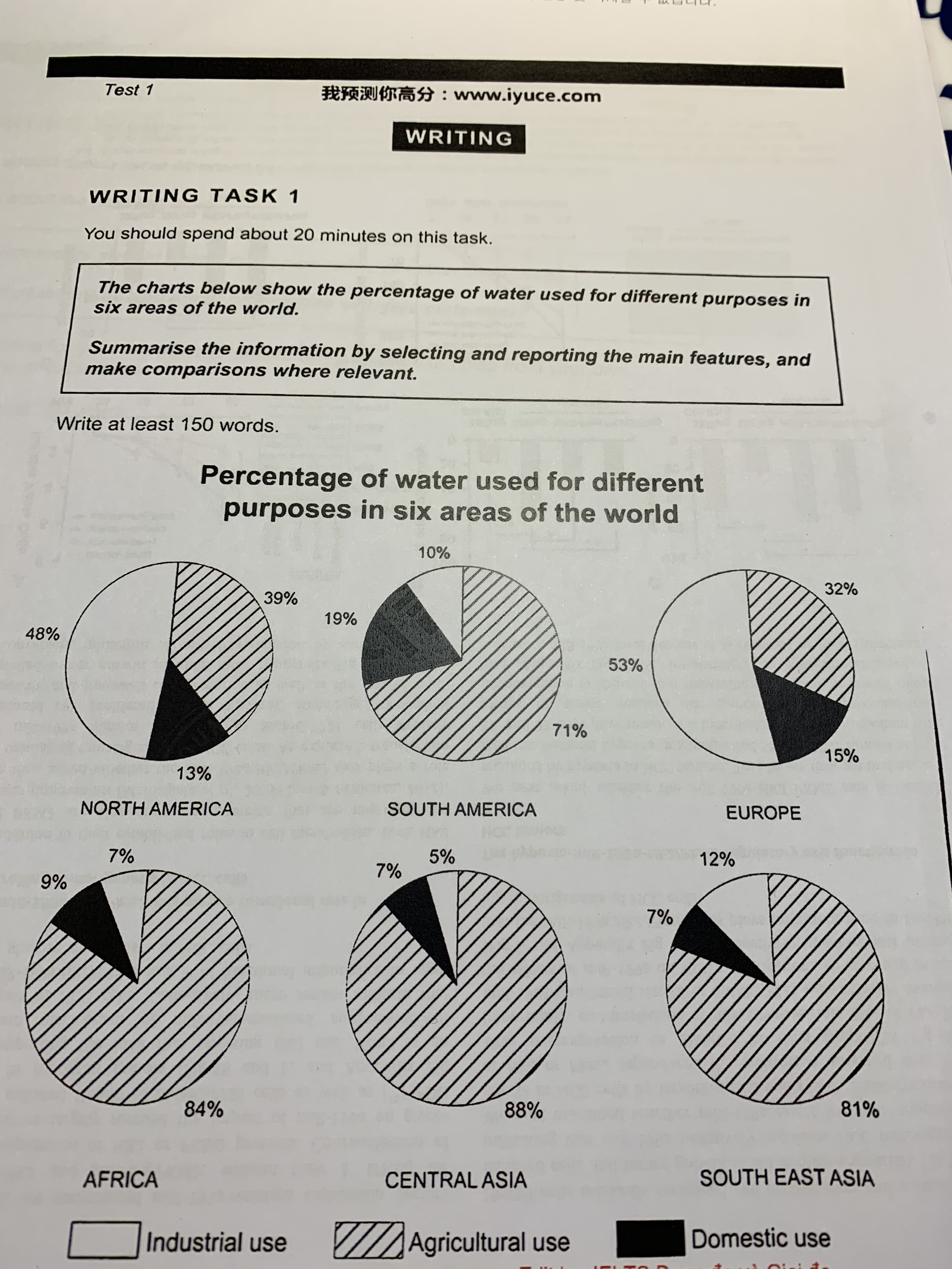
The pie charts represent the percentage of water used for three different purposes in six areas of the world divided into 3 different usages such as industry, agriculture, and domestic. These 6 areas show slightly different patterns. (단순히 '다르다' 가 아니라 어떻게 다른지를 간략하게 요약할 수 있어야합니다. 이에 대해서는 링크를 하나 넣어드릴게요.)
To begin with, 4 different areas such as (such as 는 전체 중 일부를 나열할 때 사용 가능합니다. 여기는 전체 4개 중 4개를 모두 나열하고 있기 때문에 적절하지 않고요.) Africa, Central Asia, South East Asia, and South America show similar patterns. The percentage of water used for agriculture occupy the most part of these continents. These figures are 84%, 88%, 81%, and 71%, respectively. However In contrast, the sums of the percentage of water used for industry and domestic purposes are less than 30% in these areas.
On the other hand, it is clear that North America, and Europe show analogous trends. The percentage of water used for industry account for more than 45%. These figures are 48% and 53%, respectively. Interestingly, the percentage of water used for agriculture show less than 40%. These figures are 39% and 32%, respectively.
총평: (5/6/5/6) 5.5
파란색 부분, 즉 overview 에 해당하는 부분을 너무 흐릿하게만 잡을 경우 없는 것과 별반 다를 게 없기 때문에 어느정도의 구체성은 띌 수 있어야합니다. 또한 마지막 두 문단의 경우도 세부적인 분석을 추가해주시면 좋은데, 예를 들면 domestic 은 지역불문 20%를 넘기지 못했다든가, 아니면 위의 4개 지역의 경우도 공통점은 있지만 차이점 역시 존재하는데 이 내용을 추가해주셔도 괜찮고요. 수고하셨습니다 :)
https://www.gohackers.com/?c=ielts/ielts_info2/ielts_story&type=url&uid=469784undefined

 비밀번호 확인
 댓글 0개
댓글 0개


 불편사항 신고