


 인쇄
인쇄


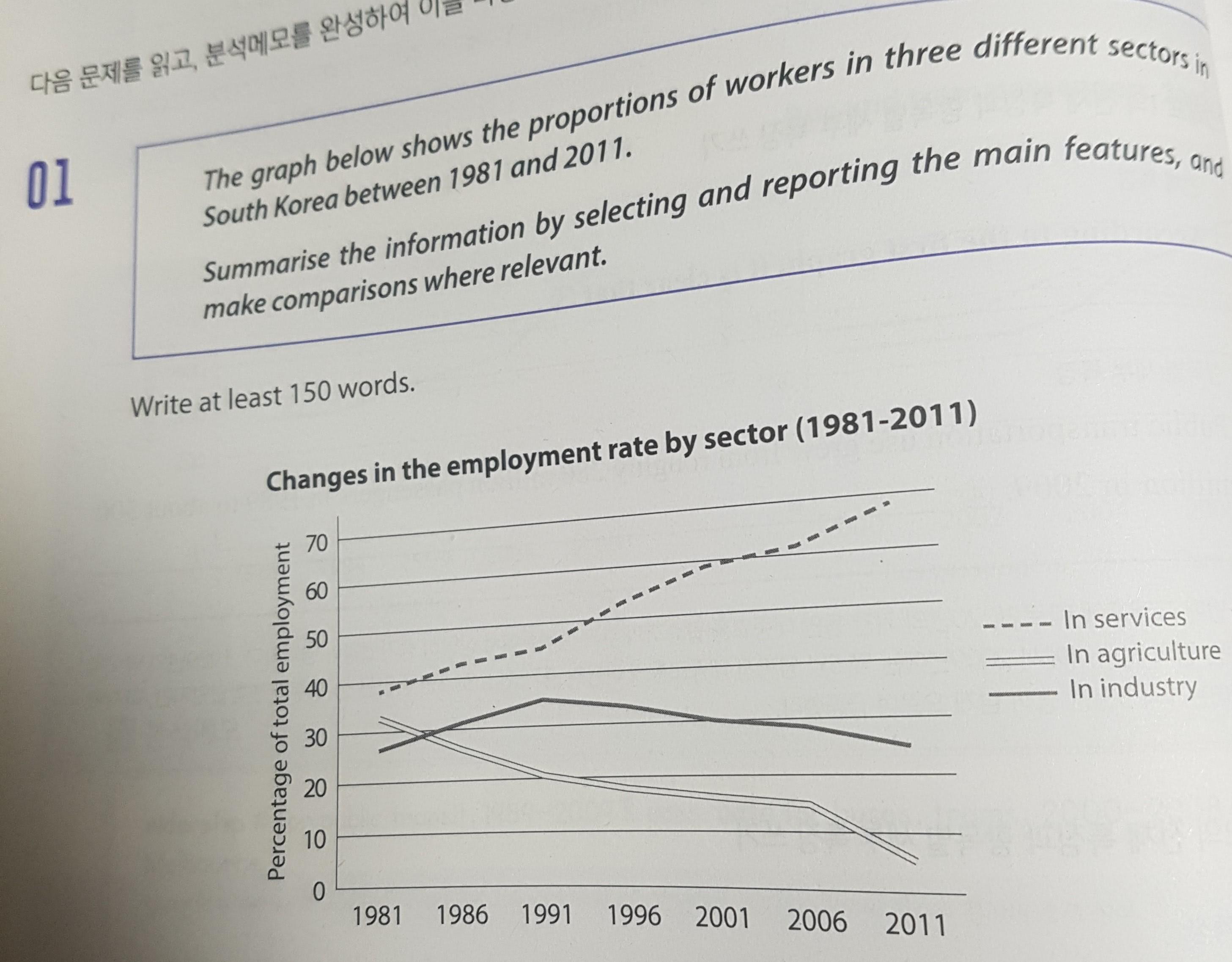
The given line chart illustrate the proportion of workers in services, agriculture and industry in South Korea from 1981 and 2011.
Overall, the percentage of workers in service was consistently the highest largest consistently over 20 years. While the portion of industry was the lowest smallest in 1981, it surpassed that of agriculture before 1986, and occupied nearly 30% at the end. the The proportion of the worker in agriculture decreased gradually, which dropped to roughly 5% in 2011.
Looking at the graph more closely, one can see that the proportion of services increased rapidly from 1981 to 2011. Even though the portion of service was under 40% in 1981, it became roughly 70% in 2011. The portion of agriculture was roughly halved from over 30% in 1981 to 15% in 2006, and especially it plunged to 5% in 2011. While the proportion of industry increased gradually until 1991, when the pattern of increasing was converted to a diminishing one, and it was it reached under 30% in the end, which was similar to the proportion in 1981.
총평: (6/6/7/6) 6.5
이번 글에서 저는 조금 후하게 드려서 6.5이긴 한데, 아마 높은 확률로 대부분의 채점관들은 문장 구조의 반복으로 인해 6.0으로 내리지 않았을까 예측해봅니다. 모든 문장들이 죄다 the ~ of ~ 구조로 이루어져있으므로 안정적인 6.5가 필요하시면 반드시 이 구조에서 어느정도의 탈피는 필요합니다.
또한 이번 글의 경우도 Overview가 문제가 됩니다. 구체적인 수치를 절대 넣지 않도록 해주세요. 수치는 looking at the graph more closely 에서 closely에 해당됩니다. 둘을 꼭 구분해주세요~
수고하셨습니다 :)

 비밀번호 확인
 댓글 0개
댓글 0개


 불편사항 신고