


 인쇄
인쇄


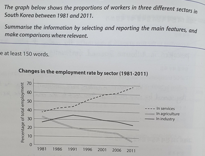
The given line graph illustrates information on the percentage of employees in three fields in South Korea, from 1981 to in until 2011.
Overall, it is clear that the sector of service is the famous (이런 걸로 패러프레이징은 절대 금물입니다. 그냥 높았다고만 적어주셔야하지, 이걸 유명, 인기 등으로 끌고가서는 절대 안돼요.) work for Koreans whereas, there are is a decrease in the rates of agriculture and industry sectors over the given period.
In detail, in 1981, people who work in service fields recorded slightly under 40% of the total which was the highest among the employees of given three two sectors at the same period. There was not any slight fell without others. (여기는 댓글 주시거나, 다음 글에 알려주세요!) It depicted a steady increase to reach a high of approximately (이거 많이 틀리시던데 주의해주셔야합니다.) 70% by 2011.It means that the ratio rose by 30% points over 3 decades.
Meanwhile, around 32% accounted for the sector of agriculture and the percentage of 28% approximately (둘이 순서만 바꿔주시면 됩니다.) was seen in industry in 1981 (이 previous 도 많이 틀리시던데 주의해주세요~) the previous year. Between 1981 and 1986, there was big change that both two rates met at about 30% and then, the proportion of workers in industry surpassed that of agriculture. Since 1991, the percentage of agriculture plunged. The number of workers showed in the industry a considerable rise at the same year, but it experienced a fall until 2011.
총평: (6/6/6/6) 6.0
previous 를 이전부터 잘못 사용하고 계셨으므로 주의해주시고, (기준점이 잡힌 상태에서 '바로 전' 연도를 표현할 때에나 사용 가능합니다. 헷갈리시면 이것도 그냥 가용 범위에서 아예 빼버리세요! 잘못 써서 틀리는 것보다 안 쓰는 게 훨씬 낫습니다.)
또한 task 1에서는 더더욱 패러프레이징할 때 조심해주셔야하는데, 어차피 7점 필요하신 것도 아니고 해서 개인적으로는 안 하는 걸 추천드립니다. 굳이 안 해도 6점 정도는 충분히 받으실 수 있어요~
수고하셨습니다 :)

 비밀번호 확인
 댓글 0개
댓글 0개


 불편사항 신고