


 인쇄
인쇄


The accompanying pie graphs show the utilization of online networking by people in Australia in 2011 and 2014. Sum up data and think about were important, by choosing and revealing key highlights.
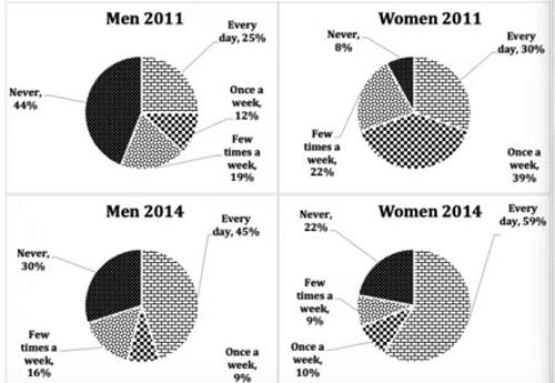
The pie graphs illustrate the percentages of online network uses of
using online networks by gender in Australia in 2011, 2014. Overall, the rates
of users among males and females inclined as time went by.
First of all, it is obvious that women
utilized online network services more than men in 2011. The rate of users who
connected at least online networks at least once a week totaled 92% among females (좋습니다.) while
the figure was 56% among males. In particular, the highest proportion of
women’s answers was once a week that accounted for 39%. Meanwhile, the largest
rate of using online networks among men was connecting every day, which figure
reported 25%.
However, there had been several changes to
using online networking by gender in 2014. Firstly, the percentage of users who
utilized online networks every day among males and females increased
significantly. The figure of men inclined from 25% to 45% while those that of women
rose to 59%. The answer of never using online networking had fallen among
males, but the figure was still lower than that of females. The gap between men and
women was 8% points.
총평: (7/7/6/6) 6.5
내용 분석은 끝에 퍼센트포인트를 빼면 크게 문제는 없었습니다. 퍼센트포인트의 경우 이전에 링크는 드렸으니 설명은 생략하도록 하고, 대신 아예 뺼셈 자체를 웬만하면 하지 않도록 해주세요~그러면 굳이 퍼센트포인트이고 뭐고 들어갈 필요도 없습니다.
문법의 경우 이게 틀렸다! 라고 할 수 있는 부분이 많은 건 아니지만, 대신 문장구조 자체가 대부분 rate/figure를 중심으로 이루어져있다보니, 이쪽에서 어느정도의 탈피는 필요하겠습니다.
수고하셨습니다 :)

 비밀번호 확인
 댓글 0개
댓글 0개


 불편사항 신고